London Music Logos Explained
The stories behind some of the city’s best-loved music identities
In 2013, we broke down the story behind some of New York City’s most iconic music logos. This time we go to the UK capital and focus in on electronic music, revealing the graphic design inspiration of just a few of London’s most revered institutions.
Boiler Room
The live gig streaming website Boiler Room has achieved total Internet domination, with thousands of fans around the world tuning in to watch each broadcast. However, when it was founded in March 2010, “we literally ripped the sign off the old 1930s heating room of the warehouse we were in, put it through a scanner, and that scan became our logo for the first six months,” explains Blaise Belville, the platform’s founder and CEO. “We never intended it to take off like it did.”
Designer Adam Tickle explained it as a cross between a Technics slipmat and the Pure Garage logo.
When they got around to creating a more official logo, Belville and crew approached their mate Adam Tickle, a true music lover who grew up just outside Manchester designing record sleeves for UK punk bands. He started going to Boiler Room’s invite-only events early on – he recalls attending Gaslamp Killer’s first London session – so understood what it was all about. “My first proposal looked like the latest Aphex Twin record crossed with an MS Dos start-up screen,” Tickle reveals. “It quickly got canned.” He convinced everyone to use the final design (a simple circle emblazoned with the name in Univers 93 Extra Black Extended) by explaining it as a cross between a Technics slipmat and the Pure Garage logo. “I don’t think people have ever made the connection,” he says.
The setup of a Boiler Room event, wherein the DJ faces the camera with the audience behind, left space for imagery in the background. The guys decided to add a big video projector screen to the mix during live broadcasts, and filmmaker Cieron Magat started placing the logo atop old rave footage – Tickle, who now works as Design Director at creative agency HarrimanSteel, thinks that’s when it really came into its own. “It was constantly flashing in your face and hard to ignore,” he explains. “It had this all seeing eye, ‘big brother is watching you’ feel to it.”
Dance Tunnel
Over the past 15 years, East London’s multicultural Dalston neighbourhood has become a teeming nightlife hotspot. Amongst the multitude of venues that buoy the Kingsland Road strip is Dance Tunnel, an unassuming basement space established in 2013 with no signage on its black door. It boasts a bespoke Funktion-One sound system, serious smoke machine and no-frills lighting, adhering to the Plastic People model wherein great music is the primary focus. One of its founders is Dan Beaumont, who also co-owns the adjacent street level pizza joint Voodoo Ray’s as well as nearby bar/restaurant Dalston Superstore (which helped cement the area’s popularity when it opened in 2009). Dance Tunnel’s programming is helmed by Matt Wickings, who books wide-ranging nights from the likes of Ostgut Ton, World Unknown, FWD and Beaumont’s own gay techno party Chapter 10.
Going into a club should feel like you are leaving normal reality in some way. We wanted to reflect that in the imagery.
Three months after opening the guys approached their frequent collaborator Nick Cobby, a freelance animator and graphic designer, about putting together an identity. They’d worked together on nights in Nottingham and felt Cobby’s aesthetic would suit this new venture. Over a slice at Voodoo Ray’s, Beaumont conveyed his desire to juxtapose the dark, concrete vibe of the venue with something colourful and not too serious – going out is supposed to be fun, after all. “We wanted something dreamlike – as if you were pulled through a wormhole that lead to an alternative anime clubbing universe. We wanted it to be soft, not hard, and sort of wistful,” he describes. They opted to take Japanese pop graphics, ‘80s geometric artwork, manga and psychedelia as inspiration and agreed the logo shouldn’t include any words, hoping it’d become a recognizable icon.
After a lot of research and several sketches, Cobby drew the final retro-hued vortex design in Illustrator. “The tunnel vision idea I guess is clear to see in the logo, but it could also be seen as a beam of light refracting too, or just a simplified tunnel stretching out into the distance,” he says. He has carried the logo’s visual style through to the rest of Dance Tunnel’s branding and flyers, making consistent use of colour gradients. Cobby thinks that the logo looks best when placed on a grey or dull background, not only to make it stand out but also to reference the stark contrast of the actual venue. “Clubs have to transport people into a different space,” Beaumont asserts. “Going into a club should feel like you are leaving normal reality in some way. We wanted to reflect that in the imagery.”
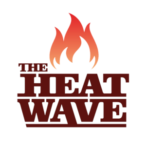
The Heatwave
For Londoners who wish to experience the Caribbean street party realness that is Noting Hill Carnival more than once a year, The Heatwave are the UK’s go-to crew for all things bashment and dancehall. Founded in 2003 by DJ Gabriel and MC Benjamin D, they help promote and strengthen musical ties between London and Jamaica via sweaty dance parties. Besides playing at festivals, releasing mixtapes and touring their roving club night Hot Wuk around the country, they also host radio shows on Rinse, NTS and BBC 1Xtra.
Our logo needed to communicate that we are not playing around.
Early on, The Heatwave decided they wanted their logo to act like a badge of honour, in the same way as the visual identities of their favourite Jamaican soundsystems, such as Stone Love, Bass Odyssey and Madhouse. “There’s the kind of ‘war’ side of it,” Benjamin D describes. “We don’t clash with dubplates, but dancehall is a very competitive world, so our logo needed to communicate that we are not playing around – that we are ‘dangerous’ in the sense that we are a competitor not to be toyed with.”
In 2009 the collective brought a Bristol-based graphic designer, Andy Musgrave, into the mix (he now works in music management full-time and occasionally does design on the side). They started by devising an aesthetic for event flyers and mixtapes before proceeding with a full identity overhaul in 2012, which included refining their flame burst logo. Musgrave drew it digitally, using a heavy weight of Clarendon – a slab serif typeface – as a base for the lettering. “The wider visual language we developed was really important in building the brand – the type systems, colourways, page layout rules, et cetera,” he explains. The Heatwave guys agree, and think the look of their logo, which they use in different colours, aptly communicates the heat they bring to clubs and mixes. As Benjamin D reveals, “Particularly in Jamaica, if something is ‘fire’, or if you ‘bun something down’, it means a specific thing – it’s like totally turning the vibes all the way up, completely smashing it.”
Hotflush
Founded by Scuba in 2003, Hotflush has consistently held its place at the forefront of electronic dance music. With years of respected, innovative releases under their belt from people including Benga, Shackleton, Mount Kimbie, Joy Orbison and the boss man himself, the label has had a massive impact on the global dubstep, garage, house and techno scenes. To mark their 10th anniversary in 2013, the team decided some fresh visuals were in order – Hotflush’s manager Jack Haighton explains that it “felt like a decent point at which to get a new hairdo.”
They turned to Sougwen Chung, a Canadian-born, China-raised, New York-based artist and graphic designer whose work explores what happens when organic and digital forms meet. She’s worked with Ghostly International and Tom Waits, as well as brands like Nike and Jagermeister, and is an Artist & Research Affiliate at the MIT Media Lab. Scuba and Haighton had seen and loved her striking imagery on Sepalcure’s record sleeves and live visuals and knew she was the right person to give their logo an update.
Designer Sougwen Chung considers a good music logo to function similarly to a meme.
“I thought the label name was already quite loaded. Evocative and emotional. The branding demanded something that could serves as a counter-point to that,” Chung says. “Something sharp, austere, mathematical. Minimal and clean, and a bit dark. Definitely sexy.” She took direct inspiration from the golden ratio – the perfect mathematical form – as she sees a direct connection between math and electronic music. The typeface is Brandon Grotesque (she describes it as “sturdy, elegant, and nuanced”), and the triangular shape was originally sketched by hand and then composed as a vector graphic.
Haighton loves the logo for its instant recognizability as well as its starkness – the label has produced records, t-shirts, bags, caps and even 3D printed bronze necklaces of it. “Its geometric form allows it to be fragmented into all manner of patterns and styles without losing its essence,” he says. “The image will stay, but it can also develop as we do.” Chung concurs, and considers a good music logo to function similarly to a meme. “It’s infinitely remix-able but maintains its core identity,” she asserts. “It infects culture in surprising ways.”

House of Trax
House of Trax began its life in 2012 as a safe space for no-holds-barred club bangers and the people who love them. The night’s founders, DJs Fools (Benedict Bull) and Rushmore (Matthew Thomas), had been operating another similar party for a couple years prior, Rhythm Talk, but wanted to make their new project more explicitly about dance culture. Inspired by New York and Chicago’s house scenes as well as vogue, as Fools explains, “We wanted people to get dressed up and lose their inhibitions in the club.” Over the years, selectors including Mike Q, Venus X, DJ Assault, Spooky and Traxxman have laid down all manner of juke, footwork, grime, garage, booty and ballroom sets in the sweaty basements of east London in House of Trax’s name.
I think the bold, raw nature of the music policy needed to be reflected.
To reflect the vibe they were trying to achieve with the night, Fools took design inspiration from old flyers, mainly ones for Chicago’s legendary Warehouse and Music Box venues – “The house party ones, the photocopied ones, the ones where people just wanted to get the word out as urgently as they could, all bold, all caps, that sort of thing,” he describes. He decided to create the HoT logo using Letraset, a brand of dry-transfer lettering applied by hand by rubbing the desired characters into place on paper; he opted for their Sans Serif Shaded typeface. “I think the bold, raw nature of the music policy needed to be reflected and that was executed spot on,” says Rushmore.
In January 2016 the guys will be throwing the last ever House of Trax party at the ICA, which will also mark their fourth birthday. After that, Fools will continue to DJ and push his artwork for labels like Unknown to the Unknown; Rushmore will focus on his record label, Trax Couture, which was named one of FACT’s top 10 labels of 2015.
NTS
Online radio station NTS was founded by Femi Adeyemi in April 2011 with the aim of putting out a diverse range of ad-free programming 24 hours a day, from dance music to noise rock to hip hop and everything in-between. Based out of a small but mighty hut on Gillett Square in Dalston, east London, a stretch of land popular with skaters and cheery local drunks, it currently boasts a huge roster of shows. DJs such as Four Tet, Floating Points, Throwing Shade, Andrew Weatherall, Micachu and occasionally even Henry Rollins call it home, though there are just as many weirder, more niche programs run by enthusiasts of all stripes – the station truly lives up to its tagline, “built by music lovers for music lovers.”
An NTS host had some custom condoms made with the logo on them.
Adeyemi also had a hand in creating Boiler Room so when he needed a logo for NTS he decided to ask Adam Tickle, since he’d seen his work with BR. The two sat down over a Turkish meal alongside the station’s Creative Director Shane Connolly to discuss what vibe it should have. “There wasn’t a strong idea of what we wanted at the time,” Connolly recalls. “The whole running of NTS at that point was very much ‘let’s try this and see how it goes.’” Tickle remembers bringing along a printout with 5 different logos on it: “Most of them were really cliché and had graphics of satellites or frequency waves surrounding the letters NTS. The one they chose was printed the smallest on the whole page – they definitely chose the right one.” The final logo is a bastardised version of Condensed Helvetica, the letters writ large in white against a black square background. His reference point ended up coming from the BBC, since “things usually look good when you put them in a square.”
Nowadays, the NTS logo can be spotted all over the Internet and IRL on flyers for club nights, talks and events that the station has a hand in. “An NTS host had some custom condoms made with the logo on them. I think that has to be the best place I’ve seen it,” Connolly reveals. However, Tickle believes the station’s success really comes from having great content; the same for Boiler Room. “The Boiler Room logo and the NTS logo have become marks of authenticity. If Boiler Room and NTS are happy to stick their logo on a flyer you know it’s going to be a good party, and that’s all anyone really cares about anyway.”
Phonica
One of the last true bastions of cool in central London, Phonica is a trusted spot for music junkies. Located just off Oxford Street in Soho, it’s been slinging records, equipment, books and clothing since 2003, when it was co-founded by Simon Rigg (who still serves as its manager today) alongside Heidi and Tom Relleen. The trio had already settled on the shop’s name, and wanted a logo to match that would set them apart from other stores in the area and pledge their allegiance to electronic music. Rigg explains, “We were stocking a lot of German imports, as Kompakt and its related labels were the big thing at the time.”
Their logo, which is based on the Bauhaus typeface, was designed by their friend Ed Coleman with the help of Luke Griffin. Coleman was working as a designer and animator, and was Heidi and Tom’s flat mate. Rigg, who was a fan of the club night flyers Coleman was working on, asked him to come up with some ideas. “I remember sifting through many of our collective design books and lying on my lounge floor, in a post-Glastonbury state for 72 hours, coming up with my inspiration,” Coleman describes. “I had one eye on the circle of fifths as a starting concept. Then one evening, Luke and I sat down and agreed the right direction. We took inspiration from the Constructivism movement, in particular the work of El Lissitzky, as we liked his use of simplistic geometric shapes.”
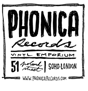
The pair wanted to use curves to represent vinyl in the logo, since records are at the core of Phonica’s identity. They introduced the small circles under the type to represent the spindles of a turntable, and Griffin added lines to connote the motion of putting a record on a turntable. Coleman thought it was vital the logo be timeless and versatile, as it needed to appeal to fans of all the different genres of music the shop has stocked over the years.
Phonica has recently added a second logo to its arsenal, which Rigg describes as more “organic.” It was hand-drawn by Pedro Carvalho de Almeida, who designs for the shop’s own Phonica White record label. “Now we use both logos at the same time,” Rigg says. “The first is the traditional, more ‘electronic’, colder logo and then the more organic, retro, ‘warmer’ logo.” Over the years, Coleman has transitioned to making concert films and documentaries – in fact, Phonica’s is the only logo he’s ever designed.
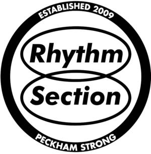
Rhythm Section
Rhythm Section began in 2009 as a twice monthly, vinyl only dance party and organically grew into a label of the same name in 2014. It’s helmed by Bradley Zero, a DJ and man-about-town who has worked at Boiler Room and co-runs club night Principals with fellow BR vets Charles Drakeford and Nic Tasker. The Rhythm Section party is held at Canavan’s Pool Club in Peckham, South London, and the label has put out stellar releases from musicians including Al Dobson Jr, Local Artist and Chaos in the CBD.
Zero initially created the RS logo himself in 2009, in honour of his first show on NTS. Influenced by the immediacy of conceptual artist Barbara Kruger’s work, he designed it on a cracked version of Adobe Illustrator using various italic, oblique, condensed and bold versions of Futura. “The interlocking hoops are symbolic of the ‘rhythm section’, the drums and the bass – meeting in the middle to create unity,” he explains. Though he doesn’t come from a design background per se, he did study painting and sculpture at the UCL Slade School of Fine Art and takes a holistic view to the connections between his work as a DJ, curator, label boss and visual artist. “I’ve come to realize that all these strands of creativity are essentially the same thing,” he says.
This is an undercover ode to the D.
Over time, the logo has evolved to include a circular ring around the hoops that bear the words “Peckham Strong.” The ring is handy for when Zero creates event posters, as he can include imagery related to the night inside. “The ‘Peckham Strong’ was a direct homage to Moodymann and his ‘Detroit Strong’ logo,” he explains. Detroit house has heavily influenced the sound and vibe of the Rhythm Section parties, and this initial small nod has taken on a life of its own. “Now when I go to far flung places to play music, people might shout ‘Peckham Strong!,’” he reveals. “I cringe a little – this is an undercover ode to the D.”
Rinse

DJ Geeneus founded pirate radio station Rinse in 1994 at the tender age of 16, helping to promote and grow London’s burgeoning grime and dubstep scenes through countless hours of broadcasts from friends’ bedrooms. When he brought Sarah Lockhart on board as his business partner in 2004, she had a clear vision: to obtain a broadcast license and become a legal station. It was a hard-won victory that ultimately took five years, an achievement that has been bestowed on very few pirates in the history of UK radio.
Lockhart, who still serves as the station’s manager today, thought that a fixed-up, professional look could potentially help Rinse snag a license. Up until that point they couldn’t market the station (apart from club nights and DJ compilations) for fear of legal repercussions, but were now ready to fight for legitimacy. In 2006 she approached graphic designer Stuart Hammersley, head of a studio called Give Up Art, to create a new logo. She’d worked with him before on the identity for record label Tempa and legendary dubstep night FWD>> (both of which she founded, in 2000 and 2001 respectively) as well as on loads of flyers and record releases. “I remember saying to Stuart, ‘I know we’re just a pirate, but I’m gonna get a license. We’re gonna become a big thing. And I want [the logo] to be able to stay the whole journey, and I want it to do the talking,” she recalls.
Hammersley’s brief was quite open, and he ended up creating custom letterforms with the help of a designer friend, James Edgar. The shape of the ‘R’ contains a quote mark, which he considers a happy accident. “I always wanted to have an icon as well as a full word mark,” Hammersley explains, “so the ‘R’ in the circle came about as the shapes fitted really nicely together. Circles equal records, right – or maybe that’s just a bit of post-rationalization from me?” Both he and the folks at the station have found the white ‘R’ icon handy in that it can sit comfortably atop virtually any colour and still feel on-brand. “There’s a kind of angular awkwardness to it that I really like,” Hammersley says. “And that feels very Rinse-like.”
Lockhart and her team are still in love with their logo and its cross-genre appeal; they consider Hammersley the station’s brand guardian. The ‘R’ has even been spotted shaved into people’s heads at Rinse events. “We’re quite emotional about the way that things look, the brand and the typography,” she explains. “A lot of the time we don’t really say too much. We don’t say, ‘Hey, we’re really great.’ We just put the content out. We’re relying quite a lot on that vision and the visual and how people perceive it. You’ve got to get a lot in the perception, which I think we’ve done quite well actually.”
Young Turks
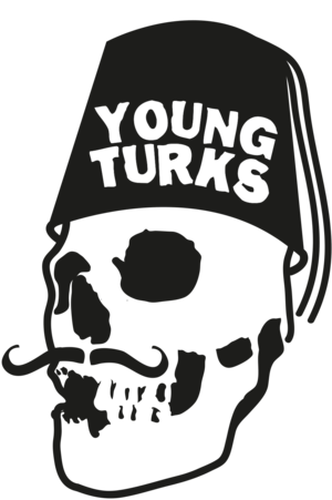
Young Turks, one of London’s best-loved record labels, was founded by Caius Pawson in 2006 as an imprint of XL Recordings. These days it’s home to cream of the crop musical talent spanning multiple genres, including FKA Twigs, The xx, John Talabot, Sampha and SBTRKT. Their cheeky logo, which depicts a human skull sporting a fez and moustache, dates back to the parties Pawson threw under the same name before officially forming the label. At the time, fledgling graphic designer Kate Moross was attending loads of gigs, hoping to design for the labels and artists she loved. She met Pawson in the queue for club night White Heat and struck up a conversation; soon after, she created early flyers for his parties as well as the label’s first official website.
Moross explains that, when Pawson realised a logo was in order, he put a competition on MySpace to design it and, “he hadn’t had many entrants, so he asked me if I would make one. I was the winner and I got £100.” He requested a skull wearing a fez, and Moross stuck to the brief quite closely. Her original design was based off a hand-drawn image that she then simplified in Illustrator with added extra elements. The type is hand-drawn as well, but based on a font. Her working files show various iterations of the logo wherein the skull’s fez is red, or the type sits next to it instead of on the hat.
Since the MySpace days, she has gone on to found Studio Moross, where she takes on art direction, branding, music videos and design projects for clients like Disclosure, Jessie Ware, NME and even One Direction. She’s very proud of her roots and still loves the Young Turks logo: “It’s great to see it on the artwork of such amazing musicians,” she says. “I’m really proud to have had a small part in it.”