Stressed: The Life & Art of Matt Reid
Michael Gonzales remembers the stunning work of the artist known as Matt Doo.
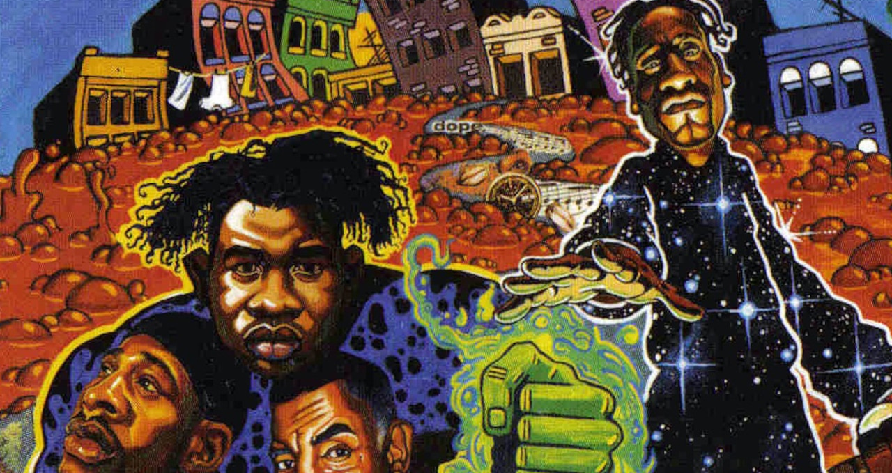
Anchored by the brash verbal density of rappers Pharoahe Monch and Prince Poetry (Po), the soulfully jazzy and often dark Stress: The Extinction Agenda has made a lasting aural impression. Praised by then-leading hip hop publication The Source, who described the rappers as “verbal contortionists, creating moving molecules of syllables and sounds,” the album solidified the legacy of these b-boy innovators.
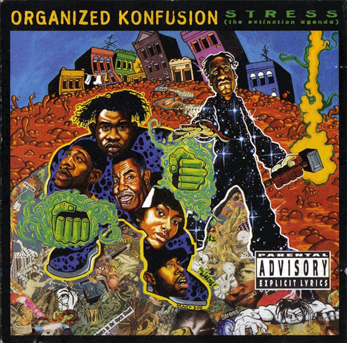
Yet it’s virtually impossible to talk about Organized Konfusion’s genre-busting album without waxing poetic about Matt Reid’s bold mix of graphic design, comic books, collage, sci-fi, animation and surrealism. Sharing rack space beside scores of eye-catching rap covers, including Daniel Hastings’ disturbing cover shots for Gang Starr (Hard to Earn) and Jeru the Damaja (The Sun Rises in the East), the far-out beauty of Stress stood out. Before one even listened to the record, Reid’s image served as an introduction to the left-of-center urgency of the group.
I wanted to break boundaries.
“Artwork of this style had not really appeared on a rap album cover before,” Reid told Dangerous Drawings in 1997. “When the cover came out, people said, ‘Oh my God. Who is the artist behind this piece?’ Contemporary rap covers are pretty simplistic. I wanted to break boundaries.” Coming from Queens, New York, the same borough as the Konfusion kids, Matt Reid was an around-the-way boy who had been into comics, rap music and graffiti since he was a small boy. Determined to incorporate the mediums into his visual landscape, he described himself as a “hip hop painter,” who like a producer, “sampled many styles and incorporate[d] them into my art.”
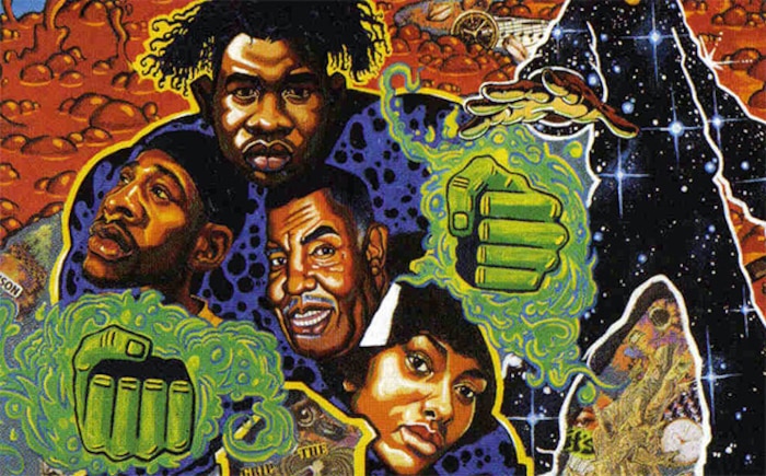
Drawing a lineage between the aural power of rap and visual supremacy of superheroes, Reid rendered Pharoahe Monch as a combination of the Hulk and Doctor Strange while Po carried a mighty magical hammer like Thor. “On some crazy shit, I used to carry a hammer around for protection,” Po laughs 20 years later. Simultaneously galactic and ghetto, for many, the Stress cover was the perfect realization of Reid’s wild styled visions.
I was introduced to Matt in the late summer of 1996 by his girlfriend Tracii McGregor, who was one of my editors at The Source magazine. Matt was a tall guy with a raspy voice who resembled a young John Coltrane. Although eight years my junior, from day one we bonded over comic books (he owned 1,500), fantasy artists (he loved Simon Bisley) and, of course, hip hop. Carrying his portfolio with him, he showed me the reproduction of the Stress cover, and I was blown away by the picture’s energetic power.
“We should do a comic strip together,” I blurted, and Reid quickly agreed, suggesting that we explore the characters he’d already created for a series of futuristic t-shirts he’d drawn a few years before. Showing me the pen and brush drawings, my favorite was the cyberfunky After the Revolution 2032 AD, which featured a space-age soul sister carrying a ray gun as she defended a dystopian world where aliens kept jungle cats as pets.
LL Cool J would be rapping in front of our house.
A West Coast native, Tracii recalls, “I met Matt over the phone when I was the working as the managing editor at Urb, and he was a freelancer looking for work. Matt could talk, especially when it came to art and music. We would battle over East Coast/West Coast music sometimes, and Matt always represented for Queens.”
“LL Cool J would be rapping in front of our house,” remembers Matt’s older brother Garnet Reid from his home in Los Angeles. “We lived in Cambria Heights and Matt loved walking around the neighborhood. Mikey D. from Main Source lived nearby, Salt ‘n’ Pepa and Ed Love were also neighbors; Irv Gotti pumped gas at the station down the street. Queens was our spot; we were proud to come from there. Queens put you in the hip hop mind.”
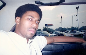
Raised by a strict West Indian mother who rarely allowed Garnet or Matt to play outside after school, the kids entertained themselves by watching television and reading comics. Four year older, it was Garnet who got young Matt hooked on comics. Bringing home the four-color delights of Marvel, the brothers Reid fell deep into the universe of Spider-Man, Thor, and X-Men. Both were mesmerized by the action hero art of Jack Kirby and John Buscema. “When I taught Matt how to draw, that’s all he wanted to do,” Garnet says. The brothers started creating their own comic characters. “Matt drew himself as a superhero, and called himself Elephant Man.”
Yet, as much as the boys were into the latest cosmic adventures of Dr. Strange and Iron Man, hip hop culture was also a major influence in Matt’s developing aesthetic. “I’m a product of hip hop,” Matt told me. “’Rappers Delight’ came out when I was five; a few years later, I was into graffiti. I went to the walls, but I wasn’t really a writer, but it did influence me; I loved it. The main rule in hip hop was, no biting, which means just do your own thing. I try to apply that with whatever piece I’m working on.”
As a student at Linden Junior High 192, he continued to draw comics, although he was sometimes ridiculed for his habit. “A few of the kids acted as though me drawing comics wasn’t macho enough, but I soon discovered a secret: They might not admit to reading The Fantastic Four or Iron Man, but if you went to their house, even the hardest hoodlum had a comic book on the side that he read when he thought no one was looking.”
He loved the rawness of Basquiat’s art and persona; Matt felt there was a realness that he related to.
Although brother Garnet exchanged his comic books for turntables and blank sketch books for lined notepads, Matt stuck with his issues of Heavy Metal. In Matt’s senior year of high school, the Reid family relocated to Long Island, where Matt’s teacher insisted he apply to the School of Visual Arts (SVA) in Manhattan. “My first year at SVA, I learned about the Renaissance, sculptures, Pop Art and abstracts. We’d go on school trips, and I’d see these huge Jackson Pollocks with paint splashed on them or these graphic shapes of Mondrian; all of that stuff was new to me.” Silently walking through the Met or MOMA, he appreciated these new visual experiences, but the b-boy side of him was still doubtful.
“These were the same people who would tell me that graffiti is not real art, but they were into symbols and splattered paint,” Reid said. “I know these artists had knowledge of composition, design, layout and colors, but I still think that some of the graff and comic book artists equaled their genius.” Nonetheless, Matt did develop a passion for surrealism, especially Salvador Dali and Jean-Michel Basquiat. “The Basquiat name was always being thrown up,” says Tezmore, a fellow artist and childhood friend who had known Matt since the fourth grade. “He loved the rawness of his art and persona; Matt felt there was a realness to Basquiat that he related to.”
Garnet too remembers when his little brother started changing, becoming a little less hood and a bit more black bohemian. “In college, he had a total transformation. He went from looking like Redhead Kingpin to wearing a long coat, wild hair and Doc Martens. I didn’t know much about Basquiat, but when I finally saw the movie I thought, minus the drugs, that’s my brother. Even his work began to look darker.”
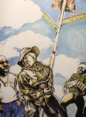
In 1993, Matt graduated from SVA. Around this time, he partnered in business with fellow SVA graduate and friend Ge-ology. A Baltimore native, Ge-ology had previously attended the same Performing Arts high school as Tupac Shakur, rapping beside the future thug lifer in the lunchroom in a group call Born Busy. Ge-ology was a year older than Matt. “There weren’t that many other black students at the school, so we gravitated towards each other,” Ge-ology says. “We both shared a passion for music, playing artists like Rakim and Public Enemy. Music and art was the glue that brought us together.”
We were hardcore, but we were still sensitive cats.
Forming the art and design firm Dooable Arts, the two collaborated on projects that included designing club invites and – much like Matt’s early hip hop art heroes The Shirt Kings – customizing clothes that they sold at the Black Expo conventions. Working either in Matt’s dorm room in New Jersey, at Kinko’s in the middle of the night, or Ge-ology’s 2nd Avenue flat, they got their jobs done and delivered.
“It was an exciting and creative time,” Ge-ology says. “He introduced me to his friend Tez, who had known him since fourth grade, and he also worked with us. The three of us were so close.” Adds Tez, “We were hardcore, but we were still sensitive cats.” Depending on the job, their creative roles would rotate, with one person designing the logo while the other drew the figures, and another added colors.
Calling himself Matt Doo – after his favorite childhood cartoon Scooby Doo – Matt and G were constantly networking. “Matt and Ge-ology were extensively known on the hip hop scene during that time,” Pharaoh Monch remembers via email. While it was Matt who proposed the idea to do the oil-painted and collage cover, Monch and Poetry quickly agreed. Recording for Hollywood BASIC Recordings, they were signed by legendary A&R man Dave Funkenklein and, for their second album, maintained the freedom to create their own album packaging.
“Everybody at that time was using photographs, but we wanted something different,” Po says. Staring at the textured mixed-medium richness of the picture, one can almost feel the spiritual artistic connection between the painter and his subjects. Crate diggers and record collectors by nature, Reid and company were all familiar with classic covers paintings by Pedro Bell (Parliament, Funkadelic), Mati Klarwein (Miles Davis, Santana), Richard Corban (Meatloaf), Ernie Barnes (Marvin Gaye) and Bill Sienkiewicz (EPMD). They wanted Stress to measure up.
In the hip hop world, however, illustrated covers were still a novelty. “When my instructors at SVA told me there wasn’t an illustration market in hip hop, that’s when I knew I wanted to pursue it. I made it a market,” he said. For Reid, this wasn’t just a formal job to be knocked-out to make a few bucks, but more of a visual manifestation of his love for his friends, their music and the collective hip hop culture in Queens, New York that brought them together in the first place. “For Matt, the Stress picture was personal,” Garnet says.
After playing selected tracks for Matt at their crib in Queens, passing blunts as the crew nodded their head collective heads, ideas began churning. “Matt came up with 90% of the cover’s concept,” Po continues. “He talked it over with me and Monch, and we played him some music. He didn’t hear the complete album, but we played ‘Stress’ for him, because that was something we were all going through – financial strain, family stress. Matt sometimes felt stressed by his family to choose a better paying career, but he wanted to go in a different direction.”
Divided into two parts, the top half of the Stress painting was done in vibrant oils while the bottom was a chaotic collage that looked on the verge of erupting into a riot. The painterly part of the picture, which Matt did solo, shows Monch and Poetry as superheroes emerging from bubbling lava ready to save the world.
To me, man, Matt was like a person from the future.
The faces on Monch’s body included soul singer Lynn Collins, rapper O.C., and his late father. “Matt knew my father had died, and was adamant about incorporating him into the artwork,” Monch says. Where Monch’s heart would be, we see his daddy’s face. In stark contrast, the collage below was a grittier image, showing the ghetto nightmares of brutal cops, screaming black boys, a dreadlocked man crawling from the sewer, and the constant reminder that time is running out. Using pictures cut from vintage comics, Reid and Tez constructed the collage to reflect the tensions and stress they sometimes felt on the streets of Queens. “There were still a lot of drugs and killings on the streets back then, and all of that affected us,” Tez says. “It worried us, made us paranoid, it depressed us.”
Inviting Monch and Po to his house, when Matt unveiled the Stress painting, they were blown away. “Matt had been coming around giving us updates, but when he lifted the sheet from the painting, I was speechless,” Po says. “It was on an easel and it was huge. It had to be like four-feet wide, painted on hard wood. To me, man, Matt was like a person from the future.”
Typical of the freelancer lifestyle, Matt was often waiting for checks, but Organized Konfusion tried to get him his $2,000 fee quickly. A year later, Matt moved in with Tracii, and somewhat alienated himself from his crew in Queens. “I didn’t see him much after he moved to Brooklyn,” Tez says wearily.
Meanwhile, brother Garnet had become a promotion executive at Universal Records where he worked with Nelly, Rakim, and Cash Money; the once close siblings saw each other less. Ge-ology split from the crew as well, concentrating more on solo production projects for Mos Def and Vinia Mojica, as well as participating in various art projects.
“Matt resented me leaving,” Ge-ology says. “I still loved him like a brother, but Matt closed the door for some reason. I was going to Atlanta to do a gallery show, and I tried to get him to be a part of the show, but he resisted. People loved him, but Matt had trust issues. Matt cut off a lot of people and I was one of them.”
By the time I visited Matt in Brooklyn, it was September 1996. Bringing along my tape recorder, he agreed to be interviewed for my NY Press column “Black Metropolis.” His latest illustration had just been published on the cover of Rap Pages’ “5th Birthday Issue.” Showing me the original, the picture was a dramatic portrait of a b-boy Atlas holding up the world. Inside the globe the images included an African mask, a cyborg, the hat of Vaughn Bode’s weirdo creation Cheech Wizard, a female rapper that resembled Tracii, and gold grilled corner boy.
If I told people my dreams, they would put me in a psych ward immediately.
In the world of urban magazines, Reid’s beautifully illustrated cover for Rap Pages was a first. It was this juxtaposition of African artifacts, urban landscapes, b-boyism and technology was something I dubbed “Blackadelic visions” in NY Press. “They gave me the freedom to do whatever I wanted to do,” Reid told me. “I had seen illustrated covers on Time and Rolling Stone, but hip hop mags weren’t doing it yet.” What was his soundtrack while painting the piece, I wondered. “I was listening to Bob Marley, Goodie Mob, Organized Konfusion, and De La Soul. Music always takes me where I want to go.”
However, as Matt confessed that night at his apartment, the brilliance of the Stress painting was becoming a burden. “I don’t want to be pigeonholed as the Stress artist,” he said. Unfortunately, the reality was that while Matt had loftier aspirations, the pigeonholing had already begun. “He had been turned down by Disney, and that really hurt him,” Garnet says.
Like Matt, I was also a fan of surrealism. I was a Harlem boy sucked into the manifestos of André Breton, the visual nightmares of Max Ernst, the cinematic madness of David Lynch, and the melting watches of Dali. When I inquired with Matt what his own dreams were like, he laughed nervously. “If I told people my dreams, they would put me in a psych ward immediately,” he said. “I can’t tell you my dreams, but I will say in 90% of them, somebody is trying to kill me.”

Although Matt Reid respected business, he didn’t trust corporations or the shadowy puppet masters on a mission to water down the culture. Between 1997 and 1998, his world began to change. There was less demand for his work, he and Tracii broke up, and the once blissful b-boy was depressed. In his mind, Babylon was burning and the capitalists were hanging the artists in the town square.
“Matt’s work was still progressing, because he was always trying to top himself,” Ge-ology says. “But the way he saw things was different. A lot of things built up inside of him, and he began drifting into a dark place.” Crashing with friends, Tez clearly remembers their late night conversations. “He talked about other artists, like Van Gogh, and he talked about how these artists all had hard lives. Sometimes he’d say things like, ‘They’ll love me when I’m gone,’ but I told him not to talk like that. I tried to encourage him to get a manager, but he never did. Rawkus Records owed him money, and he was scraping to pay his bills. Sometimes he didn’t eat.”
The last year of his life, the darkness just took him under.
Having returned to Queens, Matt was renting a room at a house owned by his father. “He just became withdrawn and secluded,” Garnet says. “The last year of his life, the darkness just took him under. He came to my office a few days before his death, and he was talking about seeing a snake on the train that was trying to touch him. I had no idea what he was talking about. He had just finished reading the Bible, and he would talk about subliminal messages, conspiracy theories. My life was about music, meetings and parties, so I couldn’t really relate to what he was saying.
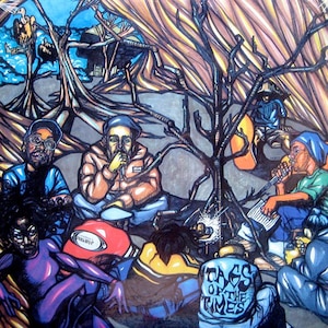
“During our last conversation,” Garnet continues, “he was talking about going to Japan, because he had such a large following there.” The Japanese hip hop market adored the Stress cover; the last piece of cover art he illustrated was for the Japanese compilation album Tags of the Times. Done in a radically different style than Stress, in the background two vultures are perched in the trees, obviously waiting for somebody to die.
On December, 11th, 1998, Matt went to visit childhood friends throughout Queens, giving away pieces of his art. “Matt spent much of his last day with me,” Tez says. “He was battling with himself over what the record companies wanted from him; Matt wasn’t just doing art for money, he was doing it for the people. He came around that day and, with my brother, we smoked our last blunt together.”
According to Garnet, that night someone took Matt to buy a gun. “He kept in touch with Tez and them, and they dropped him off on Hillside Avenue and he walked to Southside Park.” The following morning, Matt was found dead from a self-inflicted gunshot. He was 28. “There’s not a day that goes by when I don’t think about my brother,” says Garnet. “I still don’t know why he did it. Was it the books he was reading, was it because of a belief in life after death?”
When I die, I want to be known as the illustrator who just broke into every single market. When I die, I want people to say, “He did everything.”
It was Christmas time when Matt was found dead. The world was supposed to be jolly, but somebody lied. Riding to the funeral we passed decorated homes covered with decorative lights and red suited Santa Claus’ on lawns and rooftops. The scene reminded me of Norman Rockwell, another favorite of Matt’s. Sitting in the backseat of a friend’s car, dressed in my only suit, clean and pressed special for the service, I thought about Matt’s stunning artwork. The year before, he illustrated a Notorious B.I.G. obit I wrote for NY Press, and now he too was gone.
Two years before, Matt had told me, “When I die, I want to be known as the illustrator who just broke into every single market. When I die, I want people to say he did everything.” Sadly, we can’t say that, but what can be said is that Matt Reid created one of the finest visual statements of the ’90s, a true wonderland that leapt from the blackadelic shack of his blunted imagination and remains an influence.
