The Album Design of Yokoo Tadanori
Yokoo Tadanori is the most famous graphic designer that the country of Japan has ever produced. Yokoo is best known for his groundbreaking poster designs of the 1960s, but he also created a giant array of music packaging in the 1970s and 1980s. What most people don’t realize, though, is its historical significance: Yokoo’s work defines the cross-section of art and design, and it continues to inform creatively-oriented folk in Japan and around the globe today.
Yokoo was born in 1936 in Nishiwaki, a relatively small city in Hyōgo Prefecture – about a three-and-a-half-hour train ride from Kyoto today. As a teenager, his ambitions were to someday work at a post office and to paint in his spare time. After a number of years designing posters and wrapping paper for the Chamber of Commerce in Nishiwaki, Yokoo moved to Tokyo in 1960, where he began his career as a stage and graphic designer for theater. His poster designs for independent theaters in Tokyo were exceedingly popular, as they diverged from the foreshortened and flattened graphic style and high level of abstraction of post-WWII Japanese graphic design. Inspired by early Japanese packaging and its use of motifs from Japanese printmaking, package design, Chinese ornament, and Victoriana, Yokoo’s work stood out from his peers.
Yokoo’s breakout moment was his contribution to the group exhibition “Persona,” held in 1965 at the Matsuya department store in Tokyo’s upscale Ginza shopping district. (It’s important to note that department stores in Japan from the late 1920s through today are more than Western ideas of mere consumerism – a department store is shops, of course, but also involves art galleries/museums, cafés, and assumes the traditional role of the salon in Japanese culture.) The poster, titled Made in Japan, Tadanori Yokoo, Having Reached a Climax at the Age of 29, I Was Dead, was a mix of messages.
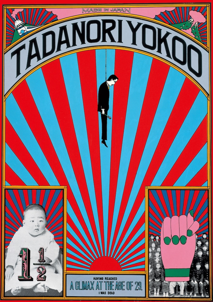
The rising sun motif, a symbol of Japanese imperialism made a wry and ironic resurgence. Mount Fuji is pictured with a bullet train speeding past while a twin Mount Fuji simultaneously erupting and being bombed stands adjacent. Yokoo’s childhood photo at age one-and-a-half is shown, as is a childhood class photo overlaid with an illustration of a hand with its thumb covered by the index finger – the symbol of lying in Japan, akin to crossed index and middle fingers in America and Europe. The centerpiece is a cartoon portrait of the designer himself, a rose in his hand, dangling from a noose. Contextually, designers didn’t do this kind of stuff in the 1960s – political commentary about imperialism and national development, suicide, much less talking about yourself. Posters were supposed to be for clients. And it freaked people out. This level of abstract self-expression was unheard of at the time, both in Japan and around the world.
That poster, along with a number of others that featured copious nudity, political expression, and grotesque violence, propelled Yokoo Tadanori into the pop culture stratosphere in Japan. By utilizing visual metaphors, metonyms, allegory, collage, and chance processes – and slamming it all together – Yokoo created design that, looking backward, disrupted the continuum of graphic design history as we know it. Yokoo was postmodern before such a term existed. His work was laden with meaning, while the individuals that he is often compared to in the psychedelic movement in San Francisco were profoundly literal in their work.
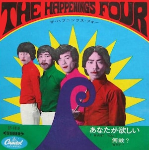
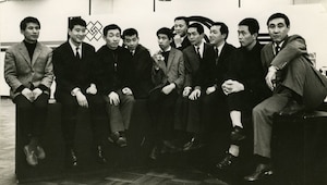
Yokoo’s had a prolific career – he’s alive today and is still cranking out book designs, posters, photography, and he’s had a simultaneous career in painting, as well. However, what really stands out is Yokoo’s design for record packaging. His earliest known record cover is a single for the band The Happenings Four – a wildly mediocre lounge-influenced Group Sounds band. The record features hand-colored photos of the band’s members, along with pseudo-psych lettering and a sprinkling of decorative elements.
The record covers that he designed in 1969 and 1970 for Takakura Ken’s Deluxe and Fuji Junko’s Red Peony Gambler, both soundtracks to popular film stars’ records that brought him even further into the Japanese public eye. His designs brought out the appeal of the rogue yakuza nature of both records. Each featured illustrations of the stars in character, mixing pop colors with Yokoo’s own deft Japanese calligraphy and offset with gradated colors inspired by traditional Japanese ukiyo-e printmaking.
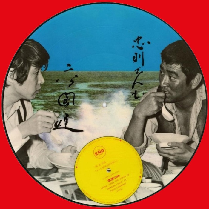
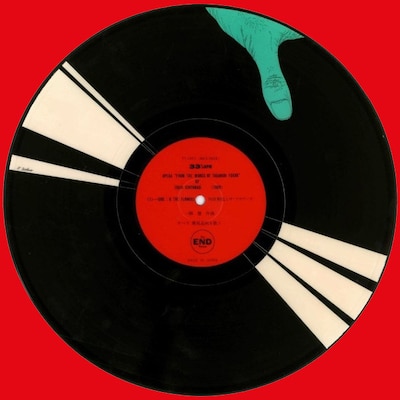
1969 also saw the release of Ichiyanagi Toshi’s Opera ‘From the Works of Tadanori Yokoo’, a hybrid psych/enka/experimental album by Yoko Ono’s first husband and former student of John Cage. This double picture disc is an homage to Yokoo’s early graphic works and is a powerhouse of design and indeterminate music.
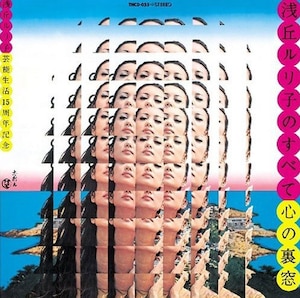
In the same year, Yokoo would design the cover for Kokoro No Uramado by Asaoka Ruriko, an immensely popular actress tied to the Nikkatsu film company and who acted alongside a bevy of Japan’s most talented actors at that time (including Shishido Jo, perhaps the first actor to have surgically implanted cheeks so that he resembled a squirrel). The album featured a mind-blowing bee’s-eye view of Asaoka, one of post-War Japan’s greatest sex symbols. It stands as one of Yokoo’s greatest graphic works – a singular piece of Brutalist collage.
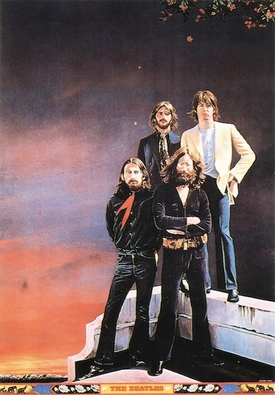
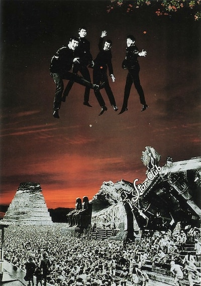
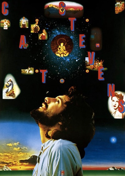
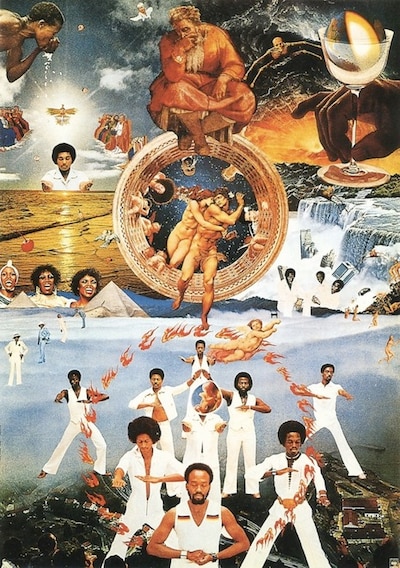
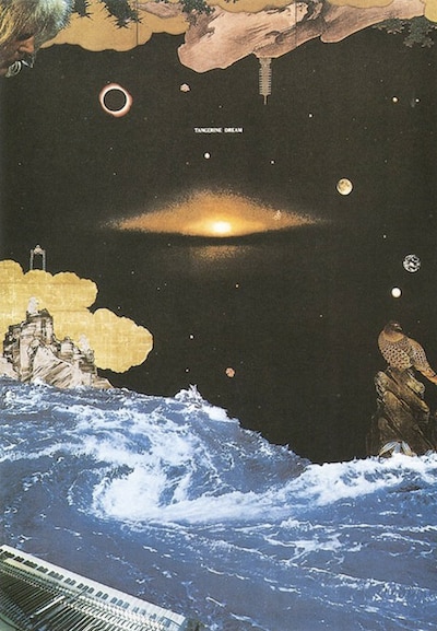
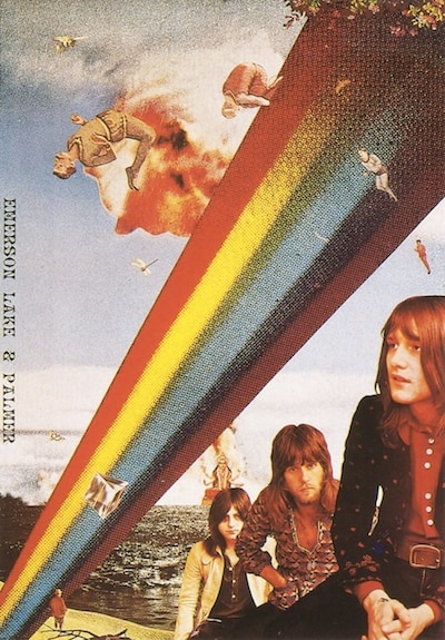
The 1970s would find Yokoo designing an arsenal of posters for international rock bands including Earth Wind and Fire, The Beatles, Emerson Lake and Palmer, Cat Stevens, and Tangerine Dream. Yokoo’s poster work helped introduce him to the international music industry, most notably record labels in the US and in Europe. In these posters, Yokoo shifted from a hand-wrought illustration-influenced style to a more collage-oriented approach. Icons of history and geography are juxtaposed with pop stars of the day – the contextualization of musicians into scenes in Babylon, Egypt, and anonymous wild jungles boosting the pop stars’ gravitas.
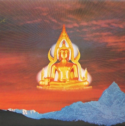
Yokoo’s design for Lotus, a live album by Santana recorded in Japan became highly popular. The record sleeve featured a photograph of a reposed Buddha against an illustration of a red lotus with circular gradient chakras floating within the composition, nestled within a fisheye camera photograph of a rising sun. This was complemented by lettering that riffs on the forms of the Devangari language. The record reflected Yokoo’s fascination with Indian imagery at the time, as well as his interest in meditation, the occult, and extraterrestrial life.
.2bbbfaac.jpg?auto=format&w=700)
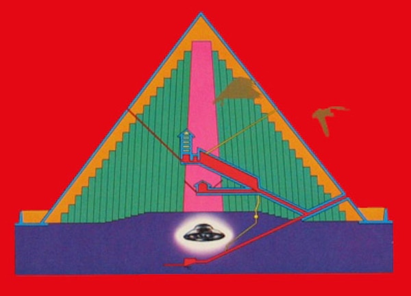
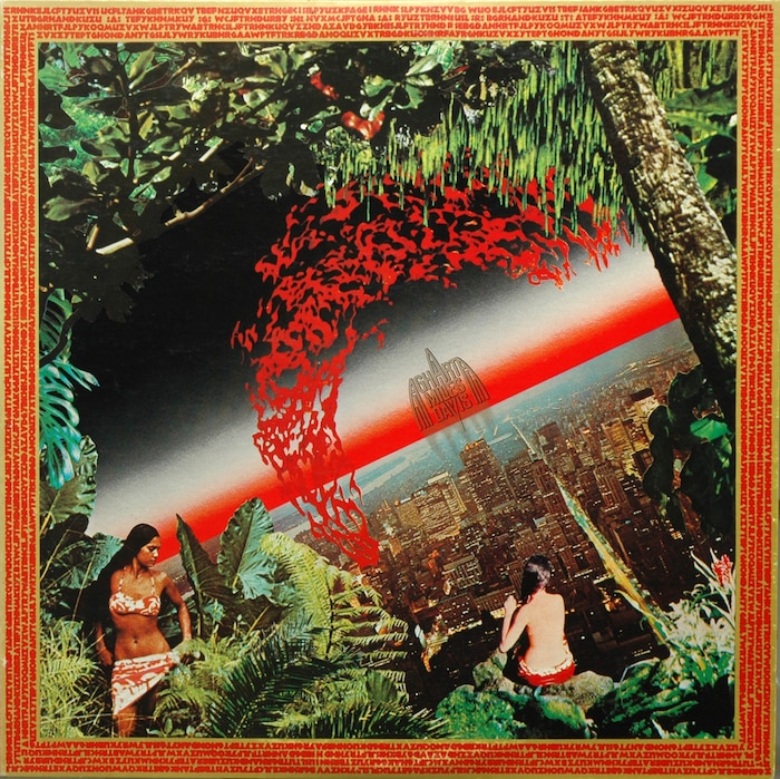
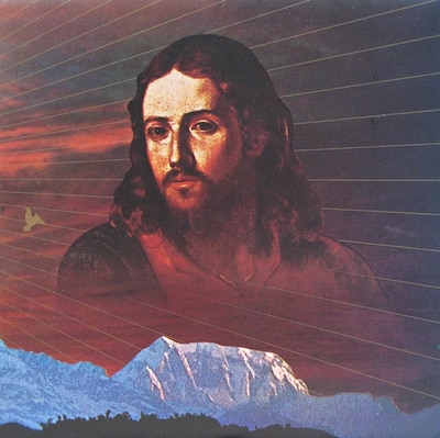
The imagery used on Lotus was given a new incarnation in Miles Davis’ Agharta double LP, a live record put to tape in Japan. Having seen Yokoo’s work for Santana, Davis asked Yokoo to create album artwork that extended these themes. Interestingly, the album design for Lotus is actually about the mythical subterranean utopia known as Agharta, while the album cover for Davis’ album is an oddball mashup of the eponymous hollow world/Middle Earth utopia, with allusions to the lost city of Atlantis, UFOs, and Afrofuturism.
The cover shows two women, perched on the edge of a jungle with a megalopolis splayed out in the background. The gatefold sleeve within the album explains Yokoo’s visuals in detail:
During various periods in history the supermen of Agharta came to the surface of Earth to teach the human race how to live together in peace and save us from wars, catastrophe, and destruction. The apparent sighting of several flying saucers soon after the bombing of Hiroshima may represent one visitation. The UFO shown here symbolizes a similar connection.
Yokoo’s search for utopias didn’t stop there – his next album cover design was for the soundtrack of the popular TV show Mu, later retitled Mu Tribe, by Go Hiromi and Kirin Kiki in 1977. Yokoo designed the opening sequence for the television show, one of the rare examples of his work in motion. Mu was a fairly banal family drama, but it spawned the oddball hit song “Rock ‘n’ roll of the Ghost / Obake no Rock ‘n’ Roll.”
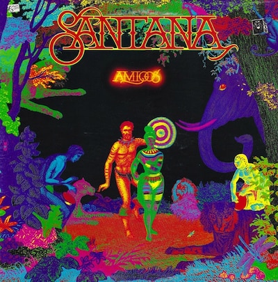
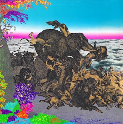
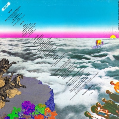
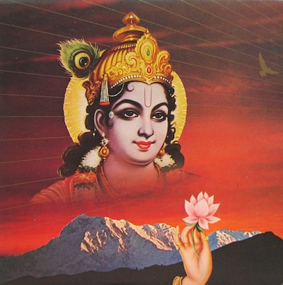
Yokoo’s next big record packaging project was Santana’s Amigos album, released in 1976. The imagery continues the visual story from Agharta with a psychedelic-looking Mayan man and woman again standing on a jungle cliff – this time surrounded by old advertising imagery of drumming “natives,” wild animals, and (looming behind) a black void reminiscent of the Lotus album. On the interior, images of Jesus, Buddha, and Kali are set against spacescapes, full-bleed floods of gold printing, an Archigram-eque diagram of a concert in a pyramid, and live shots from a Santana concert in an arena.
(Ed. note: To hear Hosono talk about this trip, click here to watch his 2014 RBMA lecture.)
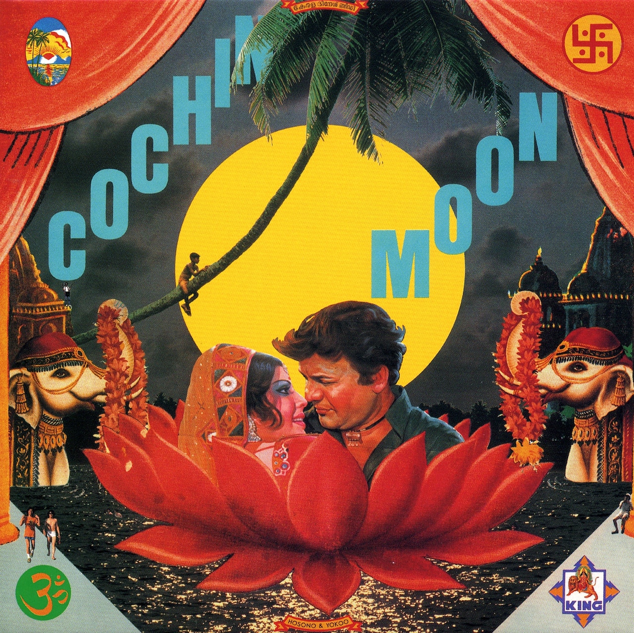
Yokoo also designed the cover of ex-Happy End/ pre-Yellow Magic Orchestra Hosono Haruomi’s Cochin Moon, an experimental “electro-exotica” album which was meant to sonically illustrate an unreleased Bollywood film. The album was meant to be a collaboration, and the duo traveled to India for inspiration, but apparently Hosono wound up having to produce the album solo, as Yokoo was the victim of extreme diarrhea during their travels in India and was for the most part confined to the hotel from which the album took its title.
.da2b4525.jpg?auto=format&w=300)
The final installment of Yokoo’s idealized/alternate futures is the design of Japanese synthesizer king Isao Tomita’s seminal 1978 album The Bermuda Triangle. The front cover of the original pressing is bisected diagonally with a looming half-moon/half-geodesic dome, a collaged gold high-heeled foot pressing on the artist’s name, and a religious icon overlooking the ruins of a Roman forum. The bottom features collaged white folks holding hands, all looking down on a Superstudio-influenced axonometric grid that is overlaid on a landscape – the bottom cells of which have lettering inscribed within which read “Pyramid Sounds.” A Roman column with a Rococo anti-pattern frames the right side, while the left shows another small cropped landscape with a darkened window pasted on it.
It is Yokoo’s body of work showing inner worlds that is perhaps his greatest gift to culture – to show that the real way out is to go in – designing records that showed as much of his dreams as they did of himself.
Notes
All names are presented in the proper Japanese order with family name first and proper name second.
Many of the images within are courtesy of the unknown author behind the Japan-centric blog Pink Tentacle.


