More New York Music Logos Explained
The stories behind some of the city’s best-loved music identities
A few years ago, we excavated the secret histories of some of New York City’s most iconic music logos. Now we’re going back to the well to explore a new crop of designs from the next wave of NYC’s finest iconographers.
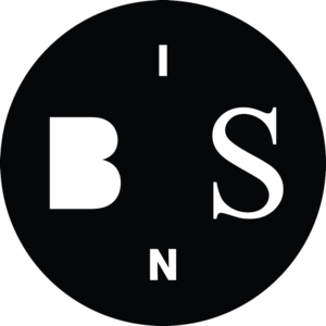
Beats in Space
When DJ Tim Sweeney was a fresh faced 18-year-old student at New York University, he decided to start a show on WNYU, the campus’ radio station. More than 16 years later, he’s still providing electronic music lovers with his finger-on-the-pulse programming on Beats in Space week after week. The show, which has since spawned a label of the same name, is perhaps best known for the guests Sweeney attracts. Each broadcast sees him sharing the decks and casually chatting with tried-and-tested selectors from around the globe, from Tama Sumo and Carl Craig to Kornel Kovacs and Honey Dijon.
During the early years of Beats in Space, Sweeney asked friends—first, producer XXXChange, followed by chiptune composer Minusbaby—to create custom logos and websites for it before deciding he wanted a fresh look in 2008. He approached Kevin O’Neill, who co-runs the studio Will Work for Good with Karisa Senavitis, because he had previously designed a couple of Sweeney’s mix CDs released on RVNG Intl. For Beats in Space, Sweeney told O’Neill he wanted a logo that could stand the test of time. “It had to be somewhat classic looking, but still new and different. I definitely wanted to try and look more pro than the college radio show it is,” he says.
I like the idea that logos often happen haphazardly or are not intended to be logos but become logos by default.
Sweeney also expressed that he wanted to play down the program’s full name, since he’d made it up while drinking with a friend in college. “I probably would have chosen something else if I knew it was still going to be around 16 years later!” he says. “We started using a sort of acronym, ‘BINS’,” O’Neill says, “which was unintentionally a simple play on record bins.” The resultant design, a circle with the letters rendered in white, uses two typefaces—Akzidenz Grotesk and Times New Roman. “I don’t really put too much weight into the design of a logo,” O’Neill says. “I like the idea that logos often happen haphazardly or are not intended to be logos but become logos by default.” Though this may be the case, Sweeney thinks O’Neill hit just the right notes with the identity and that, moreover, he’s got a special touch as a designer. “I can always tell when he's designed a record sleeve,” he says.
Black Flamingo
Black Flamingo, a Latin-inspired eatery and danceteria in Williamsburg, opened its doors in 2015. The space is a collaborative effort between the restaurateurs behind nearby Caribbean spot Battery Harris and DJs Eli Goldstein of Soul Clap, Philipp Jung of M.A.N.D.Y., Gadi Mizrahi of Wolf + Lamb, plus creative partner Bryce David. The club, nestled beneath the restaurant, is an intimate affair that looks like the interior of a sexy disco beehive, sporting upcycled plywood walls and yellow-hued strips of lighting. With some of nightlife’s brightest minds on board it provides a considered alternative to the city’s mega-clubs, championing crisp sound, good tunes, and a welcoming atmosphere.
According to David, the venue was originally going to be called just “Flamingo” plain and simple, “but Black Flamingo sounded stronger and a bit more elevated. That’s what the partners were aiming for, a refined experience in New York.” In preparing to launch, the team decided they wanted a logo that would reflect the feel of the physical environment. They turned to graphic designer and web developer Craig Butterworth, who had worked with Goldstein in the past. David explains that the brief was to make something inviting, alluring, accessible, and playful. “It’s a good thing to not take yourself so seriously, but take what you do very seriously,” he says. “That’s where the Flamingo flies in.”
Butterworth’s design, a two dimensional, line-based rendering of the majestic pink wading bird perched in its signature one-leg-up stance, achieves the spirited look Black Flamingo’s founders were hoping for. It’s also been made into a purple neon sign that sits atop the street-level front door of the restaurant, serving as a beacon to draw prospective revelers inside and down the rabbit hole. However, David says, “The logo lives beyond the actual venue. It extends itself online, in magazines, on Instagram, and reaches places much further than our neighborhood in Brooklyn.”
The Bunker
If you’re looking for uncompromising, no-frills techno in NYC, The Bunker is where it’s at. Scene stalwart and DJ Bryan Kasenic started up this club night back in 2003 at a now-defunct Lower East Side basement space called subTonic. Since then, all of the genre’s most influential luminaries have graced its booth, from carefully-chosen residents Derek Plaslaiko, Eric Cloutier, and Mike Servito, to Surgeon, Miss Fitz, KiNK, and the Ostgut Ton gang. It’s moved locations through the years—most notably spending time at Public Assembly—but now mainly takes place at Output in Williamsburg and Trans-Pecos in Ridgewood. The night jumps overseas occasionally and, with a label, podcast, and in-house booking agency in the mix too, Kasenic has built a thumping, pumping techno empire.
However, it wasn’t until 2006, when The Bunker teamed up with Wolf + Lamb on a series of afterparties, that the event got its first logo. “Branding and design was not something I really thought about, I was just a music guy,” Kasenic says. Initially designed by Wolf + Lamb’s own Zev Eisenberg, it featured an atom bomb’s mushroom cloud and the words “The Bunker” written in a large stencil font.
In 2013, graphic designer Ken Meier, who co-runs the studio Common Name with his partner Yoonjai Choi, decided to offer up their services to give it a slight revamp. He was a long-time attendee and wanted to give something back. “It was important to come up with a graphic system that accommodated not only a hectic schedule of events, but also a record label and podcast,” Meier says. “The identity had to be flexible and easy to reproduce across multiple formats.”
Ultimately, Meier decided to nix the mushroom cloud and make the design strictly typographic. The logo he created is set in a stencil version of AG Book, but the website, flyers, records, and podcasts rely heavily on the Futura T family. Kasenic is glad to have a holistic aesthetic that binds his life’s work over the past 13 years. “It actually took some time for me to realize the importance of a logo to tie together everything I do, but now I can’t imagine not having one,” he says. On a wider scale, Meier thinks that the key to a successful music identity is that it simply stays true to the sound it’s aiming to represent. “The best logos both avoid and embrace all the usual dance music clichés,” he says. “There’s really no sense in trying to make the party into something it’s not.”
Discwoman
Founded in 2014 by Brooklynites Frankie Hutchinson, Christine Tran, and Emma Burgess-Olson (aka the producer and DJ Umfang), Discwoman gives shine to often-underrepresented cis female, trans and genderqueer talent by securing gigs, curating international events, and hosting a weekly show on The Lot Radio. Through their work with female-identifying producers and DJs like Bearcat, Volvox, Juliana Huxtable, and Aurora Halal, this multitalented collective, platform, and booking agency is poised to take over the traditionally male-dominated electronic music industry one party at a time.
Initially, the ladies of Discwoman planned to spell their collective’s name using “womyn.” However, as they explain, “There was an ah-ha moment with ‘Discwoman,’ which came about pretty organically.” Using Sony’s portable CD player that was popular in the late 1980s as a reference point, they asked their friend Dylan Kelly, a photographer who dabbles in design, to re-imagine its nostalgic logo with a slight alteration.
To create the logo, Kelly (who often works on art for Discwoman’s event flyers) reconstructed the Discman identity digitally, ensuring the spin-off version was similar enough to be recognizable at a glance but subtly different in its details. “It was important for it to be visually familiar, but at the same time to provide a new association with the graphic for the audience,” he says. Hutchinson, Tran, and Burgess-Olson agree: “We were able to make a satirical version of the existing man-specific Discman graphic,” they say. The logo’s angular letters, which are used in black on white or white on black, exude a sense of strength and confidence that aptly matches what Discwoman is trying to achieve. “I think something that alludes visually and conceptually to the music and people it stands for will always be effective,” Kelly says.

Federation Sound
Born out of the grand tradition of Jamaican soundsystems, DJs Max Glazer and Kenny Meez started up Federation Sound in 1999 to bestow reggae, dancehall, and Carnival vibes on New York City’s denizens year-round. Armed with an arsenal of dubplate specials, exclusive remixes and their very own productions, the guys bring the heat to every party they play, and also hold down a weekly podcast called The Federation Invasion.
It wasn’t until the crew started making mix CDs that they created a proper logo using simple capitalized block letters that spelled out “FEDERATION.” Eventually, Meez designed a crest-style logo himself depicting two lions and employing a Blackletter typeface, but they soon found it didn’t work well visually when reproduced at small sizes. In 2010, Scion asked Federation Sound to compile an EP of original music; to accompany its digital release, the car company wanted to produce a booklet highlighting the DJs and producers involved in the project. They asked Glazer if he had any ideas for art direction and he sent them examples of illustrated dancehall posters from the 1980s by the Jamaican illustrator Denzil “Sassafras” Naar. “That style is a fairly obvious idea when you're talking about anything dancehall or reggae related,” Glazer says, “but seeing the booklet for the project definitely was the spark that led to our current logo.”
For Glazer, it’s most important that Federation Sound’s identity feels authentic.
Glazer asked Scion about who’d made the artwork, and found out it was graffiti writer and designer Sever, who he then tapped to make a new logo after realizing they had friends in common. “Max approached me with the general idea of the logo with the cloud and strong typeface. From there, I added elements and played around with the ruff stars,” Sever says, adding that they decided the logo should be neatly drawn but also look handmade. The cloud, stars and “Sound” text are all hand sketched, and the “Federation” lettering is made from a customized sans serif typeface. For Glazer, it’s most important that Federation Sound’s identity feels authentic. “We wanted to keep it really simple so the logo would be timeless,” he says, “and not just a recreation of something from that era that felt retro.”
GHE20G0TH1K
Since founding the forward-thinking party GHE20G0TH1K in 2009, queen of the underground Venus X has had a singular vision: to make a space for club kids of every shape, size, color of the rainbow, and sexual orientation to unite under one bass-heavy groove. DJ sets at her fetes skew towards vogue and ballroom house, dancehall, sissy bounce, and other future sounds. Past guests have included the likes of Kelela, MikeQ, Total Freedom, Boychild, Rizzla, and Nguzunguzu. GHE20G0TH1K has graced the hallowed halls of many grimy warehouse venues over the years, and continues to put on nights every couple weeks when Venus X isn’t touring.
At first the night had a different name, Deathwish, based on a song by the band Christian Death that Venus X says she had “a mild obsession with” in college. However, when she’d describe the event to curious friends, she’d say it was “ghettogoth” and included the word on early flyers – so people would always refer to it as GG, GHETTOGOTH or GHE20G0TH1K. “The latter was its most recent and most accurate spelling,” she explains. “I wanted purposefully to make it hard to find online, right when the internet was still kind of private.”
Radioactivity and the idea of activating via sound is what led me to use the biohazard logo initially.
Because of her confident, DIY attitude it’s not surprising to learn that Venus X created the party’s logo herself, even though she never formally studied design (though she did attend art school). She took inspiration for the identity, a black circle containing a biohazard symbol, from both the band Biohazard and Japan’s 2011 Fukushima nuclear disaster. “I was obsessed with the idea that radiation was spreading through the ocean and contaminating planet earth at a rapid pace,” she says. “Radioactivity and the idea of activating via sound is what led me to use the biohazard logo initially.”
Last year, she collaborated with her good friends at the Hood By Air fashion label on a clothing line. This led Seychelle Allah, one of their designers, to create a reworked logo which says—what else?—“play with my pussy.” Plans to use this version, which still incorporates the biohazard emblem, are currently in the works for a fresh line of merch. When asked what she hopes the GHE20G0TH1K logo conveys, Venus X says: “We are dangerous, radiation levels are high, you won’t die but you will mutate.”

Good Room
If you look at any great upcoming DJ lineup happening in NYC these days, there’s a fair chance the party is going down at Good Room in Greenpoint. Opened in 2014 by nightlife linchpin Greg Brier in the space that used to house Polish club Europa, it has a chill, local atmosphere while also managing to be a world-class dancery complete with requisite massive disco ball. Most evenings, the venue hosts nights thrown by local and visiting labels like DFA and Ninja Tune or promoters including FIXED and Kitsuné. The sizable main room is kitted out with a formidable sound system and lighting rig and is used for concerts, too. Good Room also has a smaller area called the Bad Room, where more intimate affairs (often featuring single selectors playing extended sets) go down.
For such an undertaking, it’s surprising to learn that the venue’s operators decided on a name just a few days before opening to the public. As the team was showing various industry professionals around to get their opinions in the run-up to the big unveiling, a recurring comment made was that the central area was a really “good room,” full of positive energy and potential. Good Room’s former Creative Director Emily Bachman, who works in marketing and branding, says, “we wanted something a bit more informal and just overall friendly. We wanted to do all lower case to keep it non-pretentious.” She asked a couple graphic designers to submit ideas, but nothing felt quite right.
Ultimately, Bachman herself wrote the club’s name out in Black Magic ink and a paintbrush about 100 times; together, she and Brier selected the one they liked best. “If I were to scribble an invite to a party to you and then sign my name, that was kind of the feel we were going for,” she says. Ana Fernandes—who is Good Room’s current Creative Director and masterminds its music bookings—thinks their hand-drawn identity expresses the club’s philosophy and sets it apart from the pack. “Good Room is a place for dancing,” she says. “We want our attendees to feel at ease, to let go and just be themselves. The logo definitely conveys this. It's not uptight, and we for sure are not.”
Know Wave
As part founder of clothing brand Supreme, quintessential NYC hustler Aaron Bondaroff helped shape the city’s street and skate culture in the ’90s. After gaining a solid reputation as a tastemaker he moved to Los Angeles and, in 2008, started contemporary art gallery Moran Bondaroff (with his business partner Al Moran). In 2012 Bondaroff decided to launch the online radio station Know Wave, to “create a platform for music and culture and just get archival with something.” Broadcasting mainly from New York and occasionally from LA and London, the station’s programming is diverse. On any given day you might hear shows presented by performance artist Kembra Pfahler, Dev Hynes of Blood Orange, Karley Sciortino (Slutever), or rap group RATKING.
Always armed with an arsenal of ideas, Bondaroff actually came up with the name Know Wave a few years in advance of forming the station. Wanting to pay homage to New York’s No Wave scene that came to prominence right after post-punk in the late-’70s (“I liked that they were kinda against success and they were just doing it out of a matter of life and death,” he says), he was eager to bring creative people together to spread information and promote cultural exchange. “I was like, instead of ‘No’ put in the ‘KNOW’ so it’s more like you gotta know the wave, which was like, that’s what’s happening right in front of you,” he says.
With the help of his friend Paul Takahashi, a DJ, producer, and arbiter of taste, he approached Tokyo-based graphic designer Akeem the Dream to come up with an identity. “I knew Know Wave was going to be a niche thing out of the norm where you can find obscure things,” Akeem says, “so I wanted the letters to be covered and hidden and crossed out.” Using the classic serif typeface Trajan, he initially created the logo in black and white. “From what I remember, it was the idea as a group to have the bars colored. I think it looks way better as it is now,” he says, referring to the thick red and blue lines which sit atop the type. Bondaroff agrees, and feels confident that the Know Wave logo helps give off the intuitive, DIY flavor that is the station’s ethos. He posits that he and his co-conspirators can turn any name or idea into a thriving brand but, in this case, “luckily we had a great logo to [help] bring [the station] to life.”
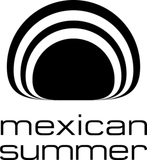
Mexican Summer
Greenpoint-based label Mexican Summer was established in 2008 as an imprint of Kemado Records by Andrés Santo Domingo and Tom Clapp, alongside Keith Abrahamsson. The crew's initial plan was to focus on the indie spectrum via subscription-only, limited edition vinyl (as opposed to their output on Kemado, which comprises more straightforward rock ‘n’ roll). However, after putting out successful records from chillwave pioneer Washed Out and lo-fi surf pop duo Best Coast, they decided to offer additional format options. Over the years Mexican Summer’s roster has included musicians and bands like Ariel Pink’s Haunted Graffiti, Tamaryn, Peaking Lights, Torn Hawk, and Dungen. They’ve also spawned imprints Software, which centers on electronic-leaning producers like Slava, Thug Entrancer, and Suicideyear, as well as Anthology, which handles reissues.
According to Abrahamsson, who heads up A&R for Mexican Summer, the need for a logo became clear once he’d thought of the label’s name (which he borrowed from the title of a song by Kemado artist Marissa Nadler). “Mexican Summer conjured up a strong visual and we wanted to have an identity that people would start to recognize and trust,” he says. He approached graphic designer Dan Schechter, the Creative Director at Portland-based studio Instrument, to develop some ideas, as they’d previously worked together on projects for Anthology and Kemado. Schechter reveals that most of his early concepts were riffs on the Kemado logo—but Abrahamsson was hoping for something entirely new, so he set out to find an image that would evoke “the languid peace of afternoon heat” without playing too literally on anything Mexican.
It’s the moment when the sun takes the form of the Greek letter omega as it sets over water.
Schechter started thinking about how the sun becomes warped as it meets the horizon, and discovered that what he was imagining had a name: the omega sun. “It’s the moment when the sun takes the form of the Greek letter omega as it sets over water,” he says. He started with a pencil sketch and then redrew the form in Illustrator. The type is a customized version of a font that used to be called Microgramma, but is today known as Eurostile. “The bloated curves, called ‘super shapes’ by the original type designers, seemed to fit the logomark,” Schechter says. Abrahamsson, who has always been partial to label identities from the 1960s and ’70s, felt it was important to capture that aesthetic while remaining contemporary. “Dan has always excelled at creating a familiar, warm feel while retaining a sense of now,” he says. “One thing we knew we didn't want was a total throwback vibe, which I think he achieved.”
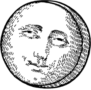
Mister Saturday Night
Justin Carter and Eamon Harkin have spent the past seven years carefully experimenting with how to successfully achieve dancefloor utopia. As the resident DJs and founders of Mister Saturday Night and its daytime offshoot Mister Sunday, they’ve been bringing together Brooklynites—and, more recently, international revelers—to worship at the altar of disco, house, and techno. If you’ve been to one of their pure-hearted events you know the rules, which are often posted up on walls or trees near the DJ booth: no photos, phone calls or smoking on the floor, be nice to people, tip your bartender and, most importantly, have fun.
When Mister Saturday Night debuted in early 2009 at Santos Party House, they used a logo that Carter had handwritten himself before adopting a more straightforward type-based version. That autumn they started bringing the party to Brooklyn DIY venues like Market Hotel and 12-Turn-13 – spaces that people actually lived in. The idea to revamp their identity to reflect this and give off a warm, inviting vibe was spurned while trading ideas with a graphic designer friend, Andrew Nimmo. He sent over a draft of a flyer featuring tiny moons, and it was a “Eureka!” moment. Knowing that they wanted the logo to seem handmade, they honed in on an antique woodcut of a man in the moon with a little friendly smile. “We wanted people who didn’t know anything about dance music to be able to look at our flyers and feel like they’d still be welcome at our parties,” Carter says. “We all think the most exciting party is one where you don't know who could be there,” Nimmo says. “We wanted a cipher that would hopefully make your eyes perk up, and make you start wondering what kind of party it was, rather than situating it in a definite demographic.”
The Misters used this woodcut version of the moon until the end of 2010, by which time they’d been putting on their events outside of traditional clubs for over a year. “We started to feel like the parties really had a unique identity—we were doing everything with the help of friends, setting the sound and lights up, setting the bar up, running the door,” says Carter. They chose to refine the logo further by asking Dutch-born, Berlin-based illustrator Anje Jager to take the woodcut and give it a modern, lighthearted spin. “The great thing about having the moon in a simple, current style is that you can take him anywhere,” Nimmo explains. “He's been redrawn [first by Anje, and more recently by Ha Ly] as a jack-o-lantern, a Mayan carving, the Tin Man, a New Year's Eve partygoer, a snowman ... plus he pairs well with illustrated landscapes and portraits. He really gets around.”
Mixpak
With a hugely diverse roster of talent on its books including Popcaan, Murlo, Sissy Nobby, Jubilee, Vybz Kartel, and Palmistry, record label Mixpak cultivates the perfect soundtrack for brukking out. Founded in 2009 by producer Dre Skull, the Brooklyn-based outfit continually pushes genre boundaries and breaks down barriers via its innovative Caribbean-tinged dancehall, riddim, club rap, and bashment releases. From a well-appointed studio in Williamsburg, the team workshops ideas with songwriters, carefully develops its artists, and crafts fresh tracks that will no doubt destroy dancefloors around the world.
In choosing the label’s name, Dre was inspired by a 1987 Eric B and Rakim album, The Mixpak Elpee. “I wanted a name that was quite open ended and that didn’t connote anything too specific,” he says, “so that the word would take meaning from the label’s releases and presence.” More simply, he just liked how it looked. Dre reached out to a few artists to design a logo but, after many months spent looking at sketches, nobody had hit on anything that seemed to fit. Mixpak’s first records started coming out with no branding on them, and Dre realized he just needed to get it done. Though he’s not a designer, he decided to try his hand at devising a logo himself (“It’s important to note that my design skills are limited and those limitations informed what would be possible,” he says).
After considering giving the identity an abstract musical association that looked similar to music notation, he instead opted for Helvetica Neue—in all caps—so it would seem universal. “I really wanted it to not be overly tied to the present moment because I wanted to build a brand and company that was for the long term,” he says. “I wanted the name and the logo to feel and function very much like a large corporate brand—taking its overarching meaning not from what it looked like particularly, but from all the times you see it and the context you see it in.” This has served Mixpak well, allowing for its releases to defy easy categorization and employ different visual styles. The logo’s restraint also means it doesn’t interfere with the artists’ varied aesthetics; instead, as Dre says, it can “sit a bit more quietly in the context of the artwork and our artists.”
Other Music
Other Music, a record shop specializing in underground, rare, and experimental sounds, opened its doors in the heart of Greenwich Village in 1995. At the time, Tower Records’ massive flagship store was located just across the street—a situation that would usually send many small business owners into panic mode. Instead, Other Music’s creators took it in stride, choosing their name as an allusion to Tower. But, as Josh Madell, one of the shop’s co-founders and co-owners explains, it was “really a broader statement on our selection; we don’t carry that stuff, we like other music.”
With three giant windows facing out onto East 4th Street, Madell and his team knew they wanted a large stencil logo to promote their new venture. They put their heads together and drew up a design themselves that they hoped would give off a psychedelic vibe. “Our classic oval logo uses a font based on the band Spacemen 3,” he says. “It’s a trippy, retro-futuristic look, but it specifically references a favorite band of ours.” Color-wise they went for orange and royal blue to reference the Mets and the Knicks, though have rendered the identity in other hues over the years.
It’s a trippy, retro-futuristic look, but it specifically references a favorite band of ours.
Not only did Other Music survive the rolling tide of gentrification that brought Sex and the City-loving fans to rest their heads at nearby New York University in the early 2000s, it also outlasted Tower, which closed in 2006. Through its carefully chosen selection of genre-spanning records, CDs, books, and magazines as well as its occasional in-store performances and dedicated, knowledgeable staff, the store holds true to the neighborhood’s deep countercultural roots amongst a growing sea of Starbucks and Chase Bank outposts.
Output
It was only a matter of time before Williamsburg scored its own large-capacity nightclub, which materialized in 2013 in the form of Output. Located next to the Wythe Hotel and just a skip from the waterfront, the club’s main space can house over 450 people. Its founders’ mantra of “Output is open to anyone, but is not for everyone” allows them to cater to partiers who care more about seeing world class DJs than they do about bottle service, unlike many Manhattan venues functioning on the same scale.
The club has a longstanding policy of not commenting publicly about its operations. However, they have revealed that, when planning their identity, they hit up Jon Santos of graphic design studio Common Space. The branding specialist explains that the folks behind Output were eager to have the full treatment: consultation on a name, a logo, and a style guide that could work across their website, social media channels, promotional flyers, and within the space itself. “We knew going in that the elements would have to re-used many times over the next few years,” he says, “so we placed more importance on the design system than the actual logo.”
In crafting the identity, Santos sought to bring the values of Berlin’s techno scene to Brooklyn. “Our direction called for the use of analog technologies and was inspired by analog media, black and white microscope photography and early computer punch card technology—lo-fi technology that tends to be more subtle and abstract rather than nostalgic,” he says. For the logo itself he started with Wim Crouwel’s 1974 typeface Foundry Gridnik and made some custom edits, most notably by filling in the center of the “O”. Santos likes how the angular nature of the letters echoes certain architectural features of the club, as well as its sound system. As a Detroit native, he confirms that he’s proud to have participated in the promotion of an art form that is close to his roots and his heart.
Proibito Records
Established in 2013, Proibito Records are purveyors of some of NYC’s finest leftfield techno and house offerings. The label is the brainchild of Anthony Naples, the young DJ and producer behind Mister Saturday Night’s own inaugural EP Mad Disrespect. With releases by Local Artist, Hank Jackson, Huerco S., and Naples himself under Proibito’s belt, it’s hard to pinpoint the tenor of their output without feeling guilty of pigeonholing. Suffice it to say that this crew is equally skilled in crafting party tunes and songs for chilled bedroom listening.
When he started Proibito, Naples didn’t think about commissioning an identity. “I have a tendency to feel like the stuff I'm involved in shouldn't be taken too seriously, and having a logo seemed like something labels like Warner Brothers and SONY have to do,” he says. But the label’s first release, Royal Crown of Sweden’s R.E.G.A.L.I.E.R. EP, soon began to sell, and Naples’ graphic designer friend Gabriel Berrios convinced him that a logo was in order. They quickly locked in on a circle motif that Berrios had been using in some student work a few years prior and decided to modify it. Berrios liked the shape's potential to appear very visual while only using type; he wanted the design to feel urban and immediate, but not like it was trying too hard. Likewise, Naples knew what he didn’t want out of a logo: “Nothing too electronic looking, no warehouse stamped vibes, but also nothing too folky or organic.”
The lettering is fashioned from Helvetica Light with custom stretching, which Berrios thinks makes it less rigid and more attuned to a late-night, celebratory aura. “It reads easily as a logo—in the sort of modernist tradition—but it’s actually really light and uncomplicated,” he says. It’s adjustable, in that the top always bears the label’s name but the bottom can switch to any wording they want. Perhaps most importantly, it fits in with the visual style they’ve been cultivating across multiple releases. “It's music made in cities for the most part, and I think the logo sort of reflects that,” Naples says. Berrios thinks it’s nice when a label’s identity echoes the specific time and place the tracks are being created in. “I am not really a big believer in ‘timelessness’ in logos,” he says. “I think it’s much more appropriate and interesting when logos do date and start to show their age.”
Que Bajo
DJs Uproot Andy and Geko Jones are co-founders of Que Bajo, which they bill as “New York’s number one tropical bass party.” As pioneers of the global bass movement, their night adeptly fuses traditional Latin American and African rhythms with more contemporary electronic sounds. The name Que Bajo was inspired by an ad-lib in a song by the Dominican bachata singer Antony Santos.
According to the guys, it can be translated in many ways depending on the country you are in and how the syllables are emphasized. “It could be asking what’s happening, it could be exclaiming how strong the bass sounds,” they say, “or it could be a response to hearing something nasty.”
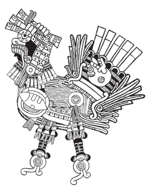
Their logo, a silhouetted rooster with maracas for legs, was designed by a friend, Debbie Silva, and initially appeared on the flyer for the first ever Que Bajo event in 2008. It seemed a fitting animal to align with because, as an iconic image in Latin American culture, ”it recalls the romantic idea of the pueblo reminding city dwellers of their roots,” Andy and Geko say. “Our rooster was a wake up call to New York City nightlife: there was too much music being slept on; it was new electronic music but it had deep folkloric roots.” Silva was killed in a car accident the year after she created the identity, but the party has honored her contribution by having other designers reinterpret her original image.
Diego Gutierrez (aka Talacha) is Que Bajo’s current resident graphic designer. His take on the rooster logo is a collage referencing his own Mexican heritage that Andy and Geko refer to as “El Gallo Azteca." “The idea was to remix something traditional and give it a new meaning, like the music,” Gutierrez says. Weaving together illustrative renderings of Mesoamerican deities, it employs vibrant graphic lines and textures that are meant to subtly relate to the intricacies of producing and DJing. “Que Bajo is the sonic manifestation of how I see myself in the world,” he says, “coming from a mixed background, living in two worlds physically and mentally, at times with opposing cultural philosophies.”
Qween Beat
Through his long-running stint as a resident at NYC’s weekly vogueing battle, Vogue Knights, MikeQ has become widely recognized as the de facto global ambassador of contemporary ballroom house. In 2005 he founded Qween Beat as a platform on which to build his name and has since parlayed it into a squad of almost 20 like-minded DJs, producers, MCs, and performers that have recently formed a proper label. This death drop empire, which counts Dvoli S’vere, Cakes Da Killa, and Byrell the Great amongst its ranks, will be releasing its first compilation, Qweendom, very soon.
In 2012, MikeQ decided that Qween Beat needed a logo as fierce as the musicians it represented. He asked a number of designers to try their hand at coming up with something and even played around with ideas himself, but nothing really fit. “We've had logos that included crowns, speakers, a headphone cord, even a tongue…but that was a bad idea,” he says. “It just needed to be something dope and neutral in a way.” He was at a party in Madrid the following year with a friend, producer/DJ Sinjin Hawke, and decided to share his logo woes—immediately, they made plans to collaborate. “We both knew it needed to be bold and iconic, and relatively simple and raw so we put our heads together and came up with something quite quickly,” Hawke says.
In 2012, MikeQ decided that Qween Beat needed a logo as fierce as the musicians it represented.
Fittingly, Hawke’s father worked for a computer corporation called Silicon Graphics in the early 1990s, so he spent much of his childhood in their offices messing around with CGI software. He thinks the company’s logo—an isometric view of a tubed cube—left an indelible mark on him, and returns to it as a reference point in his occasional design work.
It influenced his idea for Qween Beat’s identity, too, which he drew using an architectural drafting program and then did post-production in vector. “I tend to gravitate towards logos that are made with contemporary technology,” he says. “Composition-wise I find the most compelling logos are bold in one color, beautiful in three colors, recognizable from a distance, translatable across platforms, and have a nice left/right balance.” Of course, with any logo, one of the most important facets is visibility. “There was a pornographic video circulating on Facebook of individuals in a bathroom in an Atlanta club, and there's a huge Qween Beat logo sticker pasted to the toilet,” MikeQ says. “I'm like... promo!'”
The Rub
Since 2002, DJs Eleven and Ayres—along with Cosmo Baker, who left in 2012—have been bringing house party vibes to the masses of Brooklyn at their monthly bash The Rub. Though hip-hop is their primary forte, the duo consistently weaves R&B, disco, funk, soul, and more modern sounds into their sets, and churn out a steady stream of mixtapes and podcasts to boot. As anyone who’s attended one of their nights can attest, the feeling of singing along to classic tunes like M.O.P.’s “Ante Up” or Lauryn Hill’s “That Thing” when these adept selectors are on the decks can only be described as ultimate dancefloor bliss. “We’ve always approached The Rub with the understanding that if you create a fun party where the girls want to come and dance, then the boys will follow,” Ayres says.
Eleven and Ayres realized they needed a logo right when they started putting on events. A quick rise to success meant throwing parties frequently, and they wanted a consistent look to tie their posters and flyers together. Ayres recruited his then-roommate, graphic designer Josh McFarren, to come up with something that slightly referenced hip-hop without being too masculine or aggressive. At the time, McFarren was studying typography at SVA, plus DJing and promoting a deep house night. Naked Music’s releases heavily influenced his suggestion for The Rub’s logo; in fact, the label’s compilation Carte Blanche uses the same typeface, Candice. “Tasked with designing a flyer for a dance party named ‘The Rub’, obviously my biggest goal was to make it look sexy,” McFarren says. “I was trying to evoke the style of late ’70s soul and disco but update it slightly.”
McFarren’s curvaceous design appealed to Ayres and Eleven right away, as it looked like the covers of the flea market disco and R&B records sampled in party hip-hop. It also fit right in with the imagery they were choosing to include on their flyers, such as details from Jamaican graphic artist Wilfred Limonious’ drawings and Salsoul record covers. Over the years other people have created alternate versions of The Rub’s logo, including graffiti icon Stephen “ESPO” Powers, but Eleven appreciates the endurance of their original identity. “We always come back to our classic logo because it’s still so good,” he says. Ayres thinks it was McFarren’s “groovy without being cheesy” design that helped conjure the party’s first wave of success on which everything else has been built. “I don’t think it’s exaggerating to say that The Rub might not exist 14 years later if it weren’t for that logo,” he says.

RVNG Intl.
Record label RVNG Intl. has been holding it down for Brooklyn independents since it was founded by music obsessive (and, in his words, “cosmic diffuser”) Matt Werth in 2004. Known for its avant-garde leanings and commitment to an audience of true audiophiles, RVNG has put out major releases by artists including Blondes, Hieroglyphic Being, CFCF, and Holly Herndon. It also boasts archival reissues and a respected collaborative LP series, FRKWYS, which brings together contemporary musicians and revered sonic pioneers. It’s important to note that amidst all this aural experimentation, the label pays a lot of attention to what their records, cassettes, and merch looks like: from bespoke packaging to letter-pressed and hand-stamped typography to special inserts and stickers, truly innovative design solutions abound.
It was a design bean from Kevin’s magic bag.
This can be attributed in large part to Kevin O’Neill of Will Work for Good, who creates vastly varied artwork for most of RVNG’s releases (and also designed Beats in Space’s logo—Werth co-owns the BIS imprint with Tim Sweeney). O’Neill had worked with Werth in the early 2000s on his prior label, File-13, and the relationship’s strength led to O’Neill designing RVNG’s current identity in 2007. However, he explains that it was never a formal project, as such: “It was one of various logos that were used in the past. It just happened to be the one that stuck.” Or, as Werth puts it, “It was a design bean from Kevin’s magic bag.”
To make the logo, O’Neill took the label’s name as a source of inspiration. Initially a play on the word “revenge” (“though it has always been a label of love,” he says), he decided to create a protective crest icon containing, in some form, the letters “R”, “V”, “N”, and “G”. “The chevron of the crest is rotated 90 degrees so that it has no heraldic meaning but rather it becomes an envelope, as mail order was and is at the heart of the label,” he explains. Werth calls the end result “curvy and conversational.”
Sacred Bones
Though Sacred Bones isn’t easy to classify, it’d be fair to call the Brooklyn-based label a reliable hub for sounds emanating from dark realms. Established by Caleb Braaten in 2007, the label’s put out a steady stream of releases that includes the melancholy synth pop of Lust for Youth, Zola Jesus' soaring goth tracks, Gary War’s experiments in lo-fi, as well as horror film auteur John Carpenter’s first ever studio album, Lost Themes. It has generated some impressive reissues, too, notably the original soundtrack recording from David Lynch’s seminal_ Eraserhead_.
With Sacred Bones’ logo, Braaten knew he wanted to channel the aura of their offerings and evoke a mysterious feeling. “I wanted to create something that observers would be able to interpret for themselves,” he says. Turning to graphic designer and art director David Correll, who he’d worked with on previous projects, Braaten thought that a circular logo would look best on record covers (he also wanted “a logo that would look good as a tattoo”). Using Adobe Illustrator paths, Correll put together an image of a serpent in a ring formation ultimately feeding on its own tail that recalls the ancient ouroboros symbol, encasing a black triangle inside. “Designing that logo set the tone for the entire aesthetic future of the label,” Correll says.
More recently, the label has asked some of its favorite artists to reinterpret their identity, including Alexander Heir of DIY apparel line Death/Traitors and Sam Ryser of Dripper World, a shop in Bushwick’s punk Flea Market Alley. It’s the original, though, that still adorns the covers of Sacred Bones’ records. When asked what he thinks makes a great music logo, Correll says, “It’s the same things that make any logo great: they're simple. They work on their own; they're recognizable; they work in one color; they work in black or white.”
Tiki Disco
In 2009 three NYC-based DJs, Eli Escobar, Andy Pry, and Lloyd Harris (aka Lloydski) joined forces to form Tiki Disco, the ultimate outdoor afternoon dance party, complete with frozen cocktails, booty shorts, and sunglasses galore. From its humble beginnings in the backyard of then-burgeoning Bushwick pizza joint Roberta’s, the event now plays host to crowds of thousands and is a summertime staple. Prime Tiki time in the city is every other Sunday in May through September at various venues like The Well, Output, and even the occasional boat cruise, though one-off affairs happen around the world all year.
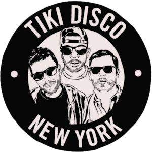
During the first few seasons of the party, the crew didn’t actually have a logo. When a promoter for an upcoming event asked for one, Harris quickly reached out to Joshua Prince, aka Dust La Rock. The late, great designer co-founded record label Fool’s Gold with A-Trak and Nick Catchdubs and served as its art director. He was, conveniently, a Tiki Disco attendee as well. “It was the real early days of Fool’s Gold so we knew some of his art through that,” Pry says. “Not being artists, we just wanted somebody we felt comfortable with to take their vision and make something good.”
Prince’s circular logo depicts illustrative renderings of Tiki’s residents looking like they mean business; Pry thinks Prince may have used some promo photos of them for reference in drawing the characters. He also says that it’s been cool to see the logo move with the party as it has evolved. Other designers have since created new art for Tiki Disco, but it’s the original identity that continues to hold its place as a piece of New York dance music history. “It seemed like a small thing then, but looking back now we're really proud to have had our logo done by such a cool guy and great artist,” says Pry. “He is certainly missed.”

Wrecked
Ron Like Hell and Ryan Smith tout their roving, down-to-earth gay club night Wrecked as “a party for gentlemen (and their friends) who like the boom.” Ron, who works as a buyer at Academy Records in Brooklyn, and Smith, who is a booking agent at Liaison Artists, also DJ together under the same name, throwing down sets comprised of premium quality disco, techno, house, and Italo tunes.
Wrecked started its life as an after hours night at the National Underground in the East Village in 2011. The pair was expecting their first event to be a one-off, and hadn’t ever before attempted a party that would last until 6am. They thought it was important to find a name for it that would convey that “you’d come, dance, get rowdy, and stay out late.” Smith came across a flyer from legendary 1980s gay megaclub The Saint that featured “a beefy daddy, tied to the back of a tow truck in a pair of very short shorts.” The night that flyer was advertising was called Wrecked. They chose to adopt the same name, thinking they’d change it later if their own event was a success. “It went off,” they say, “and everyone was calling us in the days following the party saying, ‘Gwerl, we got wrecked!’ So it just stuck.”
One of Wrecked’s regulars, a graphic designer and art director named Jordan Rivera, noticed that there wasn’t a consistent visual identity on their flyers. Ron and Smith showed him that old Saint flyer and, as Rivera says, “One of the most distinctive things about it was the typography, which they seemed to really gravitate toward.” After doing some research he found out the font used was something similar to ITC Lubalin Graph, so he used that as a jumping-off point for the design. The Wrecked boys are pleased that their identity has an element of New York’s gay heritage behind it. “We also wanted it to be something simple that would look good on a leather bar t-shirt,” they say. According to Rivera, the backwards “R” is a little nod to the first letter of each DJ’s name. “And coincidentally,” he says, “the shape of the mark is phallic, which makes sense since these guys have a huge gay following.”