Boy On Da Cover: How Grime Got Its Style
The aesthetics of grime, writes Gabriel Herrera, started with a pair of Nikes, a tracksuit, and two yellow walls
The success of grime has always been conditional. Today, the genre is a constant among the many variables in the grand equation of contemporary British music. More than a decade in the making, grime has slowly but surely crept into the mainstream, whether you like it or not.
But at the start of the millennium, East London’s music scene was hardly a fertile, creative environment. The genre’s godfathers could only have dreamed of the celebration, the depth, and scale that the music currently enjoys. Grime MCs and producers now are saddled with balancing mainstream popularity while also staying true to their roots, a classic crisis of authenticity.
Dizzee Rascal, born Dylan Mills, was one of the earliest grime artists to enjoy commercial popularity and has spent his career navigating that path. With increased attention and the constant beck and call of a pop career, Dizzee’s ability to stay linked to his origins continues to be a fascinating musical experiment, which began with 2003’s Boy In Da Corner. The album helped catalyze grime’s early sound and, just as importantly, its style.
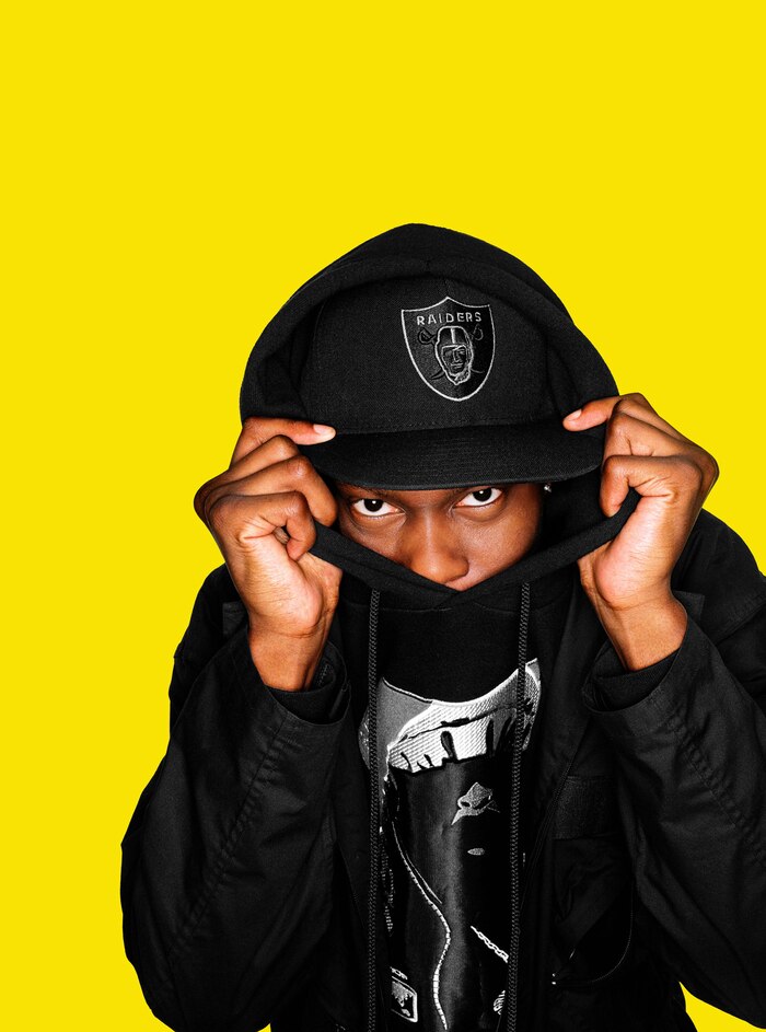
Boy In Da Corner announced Mills’ arrival with booming enthusiasm. Its cover was designed by Ben Drury, known for his extensive work with Mo’ Wax and the creative vision behind the covers to DJ Shadow’s Endtroducing..... and Wiley’s Treddin’ on Thin Ice, among countless other releases. The cover photo was shot by Dean Chalkley, a stalwart from NME, Mixmag, and Dazed & Confused. The album’s groundbreaking virtuosity was matched by its innovative design, creating a coherent vision for the future of grime before there was even consensus on the genre’s name (the biography accompanying Boy In Da Corner only used the term when mentioning the “grimey home-grown rhymes of jungle and garage MCs” from which Mills drew inspiration).

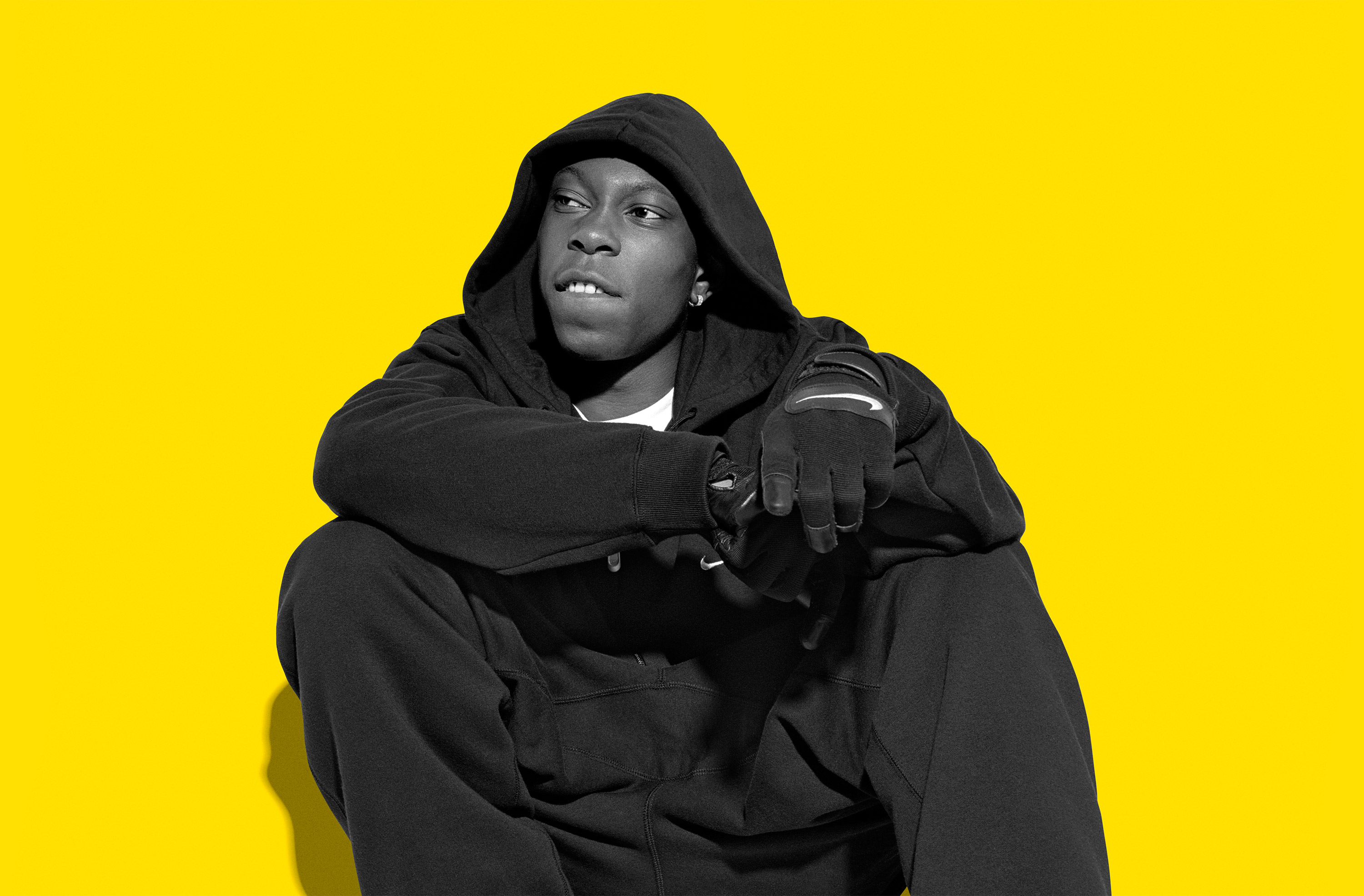
With its spotless, hazard-yellow color panels and ruggedly futuristic font, like you’d find on the hull of a mining freighter from Alien, Boy In Da Corner’s cover made a definitive visual statement that was unprecedented for the genre in its nascent form. Its iconic status has made it the subject of Lego homages and unofficial Simpsons parodies, and it’s been revered as a cultural touchstone by subsequent generations of grime artists. Those bright panels with Dizzee in its crook were more than just taking the album’s title to its literal conclusion; it was a way to transmute cultural marginalization into an electrifying jolt of self-affirmation.
Chalkley met Mills and then-manager Nick “Cage” Denton at Street Studios near Shoreditch in East London for the album cover shoot in early 2003. In a day-long session, Chalkley shot the images that that would grace the covers of the album and three singles: “I Luv U,” “Fix Up Look Sharp,” and “Jus A Rascal." Chalkley recalls:
We [already] knew it was going to be called Boy in da Corner, and we had loads of different ideas. Dizzee and his manager brought a few clothes along. It’s not like we put him in the hoodie and the trainers, that’s exactly what he would have been wearing anyway...he came like that. We shot quite a lot. You could tell that not only was Dizzee was super talented, but that he had a good sense of humor as well. There was no pretense or anything. Keep in mind that it was before digital photography; it was all shot on film.

The cover of Boy In Da Corner was fashionable without embellishment, a way to showcase Dizzee’s style without aggrandizing it. The spartan look was an ideal aesthetic for an equally spartan Dizzee, decked out in an all-black tracksuit and a matching pair of Nike Air Max BWs. It was as though he had teleported from his home district of Bow just long enough to let the rest of the world have a brief glimpse of what was to come.
Mills’ outfit on the cover of Boy In Da Corner was the barometer for a look that would help define grime’s unique fashion. Tinie Tempah recalled being captivated by the album’s cover on Zane Lowe’s Masterpieces: “It was the artwork – wanted the tracksuit, I wanted the Air Max 90s, it was just iconic. That album changed my life.”
Similarly, Skepta noted that “Dizzee Rascal got the Air Max look right on Boy In Da Corner” in Grace LaDoja’s 2015 documentary Air Max The Uniform. The film, released to coincide with the sneaker’s 28th anniversary, is a testament to the Air Max’s ubiquity in grime culture. Over the course of the genre’s growth, the Air Max continued to be a token of grime’s style, due in no small part to Dizzee’s promotion: He’d go on to collaborate with Nike on several releases, including an extremely limited Air Max 180 for his label Dirtee Stank in 2005, and a reunion with Ben Drury in 2009 to design an Air Max 90 paired with the release of his fourth studio album Tongue n’ Cheek.
But in 2003, those sneakers and that tracksuit were a uniform for the anonymous stigmatization of urban youth culture, a middle finger to the surveillance era of CCTV. The charaded devil horns might suggest the demonization he anticipated from conservative media, but it also seemed to signal a welcome challenge: an artist who was fully confident in his ability to create something powerfully new for an unfamiliar audience.
In Bow, access – or lack thereof – was the condition that helped sketch some of grime’s earliest architecture. Off on the horizon was Canary Wharf, a pristine complex of economic prosperity exclusive to the financial sector, isolated from the area, yet within view from Crossways estate, Mills’ childhood home. Closer but still out of reach were the clubs playing UK garage, fashionable dance music that by the dawn of the millennium had steadied its ascent into the mainstream and was enjoying a success buoyed by class stratification and the fetishization of “urban” music. For Dizzee and his peers, you could hear UK garage on the radio and on the street, but the bottle-popping, dress code-abiding clubs were off-limits to kids in hoodies and trainers.
The memes are only proof of its cemented place in contemporary fashion.
Dizzee took matters into his own hands. Garage was swiftly mutating in an attempt to stave off the creative stall of its radio-friendly homogenization. Meanwhile, eskibeat, sublow, dark garage, and 8 bar – all early versions for what would eventually coalesce into grime – were sprouting from and around the council estates of London simply from a lack of anything that better fit the musical needs of its creators. Often, those early cells of the genre corroded the melodic elements of UK garage down to the skeletal remains of a track, leaving almost nothing but rhythms. The more sparse the beat, the more open space was available for rappers to make their mark. In the documentary Open Mic, Mills accordingly grouses over garage because he “...thought the singing part was cheesy; I didn’t like it, I just wanted to rap at people! Listen to me! I’m sayin’ stuff!”
Grime was, in part, a rejection of established scenes rendered inaccessible to disenfranchised youth and a battleground for something new and unique to claim in its place. The sheen of the Boy In Da Corner cover reified that, creating a symbol for Mills and his music that could have the same visual power as older, more established scenes with their own elaborate style codes.
The aesthetic of grime that Dizzee helped popularize today is so pervasive that it borders on comical, but memes are only proof of its cemented place in contemporary fashion. As Dizzee later pointed out on "Chillin’ wiv da Man Dem," It’s all about the details, innit/Air Max 90 is the trainer, had to be my shoe, innit.” Dizzee Rascal’s success reflects the history of underground music culture at its best: striking art that harnesses untapped energy to create something uniquely its own.

