Collective Rendering: The Early ’90s CGI Album Designs of Phil Wolstenholme
It’s no secret that technology has had a profound impact on the development of music, from the advent of recording to the amplification of the guitar, the genesis of the synthesizer to the universal machine language of MIDI. In the late ’80s and early ’90s, computers became a consumer product, bringing music production out of expensive studios and into people’s homes. This cultural sea change would continue to gather momentum throughout the ’90s and beyond, but it wasn’t limited to music. Other creative arts were reacting with equal fervor to this convergence of technology and affordability, especially in the world of visual arts.
Sheffield artist Phil Wolstenholme graduated from Sheffield Polytechnic in 1987 with an art degree and a desire to apply his creativity to a viable career. Observing the booming electronic music scene happening around him, he reasoned that purely electronic music would want purely electronic artwork to match. After successfully applying for a grant to invest in an Amiga computer, he was able to experiment with the emergent computer graphics applications of the time.
Through early commissions for key artists and labels from Sheffield and elsewhere, Wolstenholme forged a reputation for his distinctive work, resulting in a run of record sleeves for 808 State, Pop Will Eat Itself, Strictly Rhythm and more that encapsulate the early ’90s in all its naïve charm. In the same way producers used synthesis and sampling to craft new sonic worlds, Wolstenholme shaped strange new landscapes out of digitally-rendered objects and manipulated source material. His glossy, 3D CGI graphics may appear dated when looking back at them now, but his achievements mirrored the DIY ethic of the new electronic music of the era that was leaping from people’s bedrooms into charts and raves the world over.
As well as high-profile work for Cabaret Voltaire, The Orb and the Shamen, Wolstenholme’s productive relationship with Warp Records gave rise to full-blown animation. The work he and David Slade did for the Artificial Intelligence companion VHS Motion acts like a time capsule for the early forays into rave-aligned visuals – primitive by today’s standards, but at the cutting edge in 1994. This was the era of Jurassic Park, Terminator 2 and Pixar bringing 3D CGI into the mainstream, and Wolstenholme was right there, learning and using the same 3D Studio Max software.
As the technology kept advancing through the ’90s, it became prohibitively expensive and laborious for Wolstenholme to keep up with the pace at a home computer level while making graphic design a feasible career, so he focused his talents elsewhere. Always determined to find a practical application for his art, he now spends his time photographing previously unexplored caves in the North of England, although he maintains a connection with the music world, working regularly with Richard H. Kirk of Cabaret Voltaire on new and reissued material.
Ahead of our visit to Sheffield for RBMA Paths Unknown, we spoke with Wolstenholme to tell the story of his first forays into computer-based visual arts, the technical challenges he encountered and being part of a creative movement that was defining itself in tandem with the available technology.
Who gave you your first sleeve design job?
I knew someone in Manchester who knew a guy from 808 State, so I just said, “Can you just tell him what I do?” They rang me up and said, “Why don’t you come over and show us what you’ve got?” All I had was the cover of a private press LP called The Sheffield Jazz Album, which was one of the first images I’d ever done on a computer, and lots of sample images I’d done just learning to use the Amiga.

808 State said, “Yeah, great! We’re doing this single called ‘Pacific State,’ do you want to do the cover for that?” So they gave me a quick brief and I knocked up an image for them, and then on the Monday they rang me back and said, “Bollocks, the record company’s already done one, you can do the next one.” Three months later they asked me to do the The Extended Pleasure Of Dance EP which had a row of gold 808 medallions across it. They absolutely loved it, and I ended up doing some slide projections for them at the G-MEX Centre in Manchester.
What was your inspiration for your sleeve images at this time?
I’d always been interested in psychedelic imagery and music from the late ’60s, so it wasn’t very difficult to come up with ideas for images. I just didn’t really have any idea what they meant. I’d bought a video scanner that let me bring in images to the Amiga – this is before flatbed scanners were available – and then I could start working on them and processing them, so I had “found” images at last, which was perfect ’cos the whole sampling thing was kicking off in music, so it seemed sensible to do that in visuals as well.
How much did your surroundings in Sheffield feed into your work?
Sheffield was so self-sustaining – you had all these big recording studios churning out a lot of stuff, and labels like Warp appearing. Suddenly Sheffield was the place to be, but because Sheffield’s not a particularly celebrity-oriented town you got this bizarre clash of culture where you’ve got half the world desperate to be your friend, and we’re just sitting around at home thinking, “Why are they even interested in us?” All we did was sit around and listen to music and get stoned, and everything we did seemed to be treated with the utmost solemnity. It was quite strange to have grown up in the period of the miners’ strikes in the ’70s and suddenly find that you’re actually part of one of the only growth industries in Sheffield.
I was going to have to buy a bigger computer, and someone told me, “Go and see Warp Records, they’re quite nice people.”
Were you aware of anyone else doing computer graphics for sleeve designs at the time?
There was a guy called Buggy G. Riphead who used to work with the Future Sound Of London. It turned out he was a guy called Mark who was on my course at Sheffield Poly. But he’d moved to London, and I was the only one in Sheffield doing computer graphics of any kind commercially, because I don’t think anyone else had bothered buying an Amiga.
The Amiga was a brilliant computer, but I was having to beef it up continuously – new memory cards, bigger hard drives, faster processors. When I started getting into the more complex 3D stuff, I was looking at two or three days rendering time for one image.
How did you overcome these technical obstacles to keep working?
It got to the stage where I was just going to have to buy a bigger computer, and someone told me, “Go and see Warp Records, they’re quite nice people.” I went with this outrageous proposal of, “If you give me some money to buy a new computer, I’ll do three sleeves for you for free.” Steve Beckett wrote me a check for a thousand quid there and then.
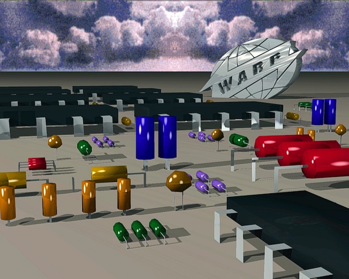
The first sleeve I did for them was the Step 12", Yeah You! I did one for Unique 3 and I did something else as well, but to be honest I think only the Step actually got released, but Warp didn’t mind. They just said, “Whatever, you did three sleeves. Anyway, how about another one?” That turned out to be Pioneers Of The Hypnotic Groove.
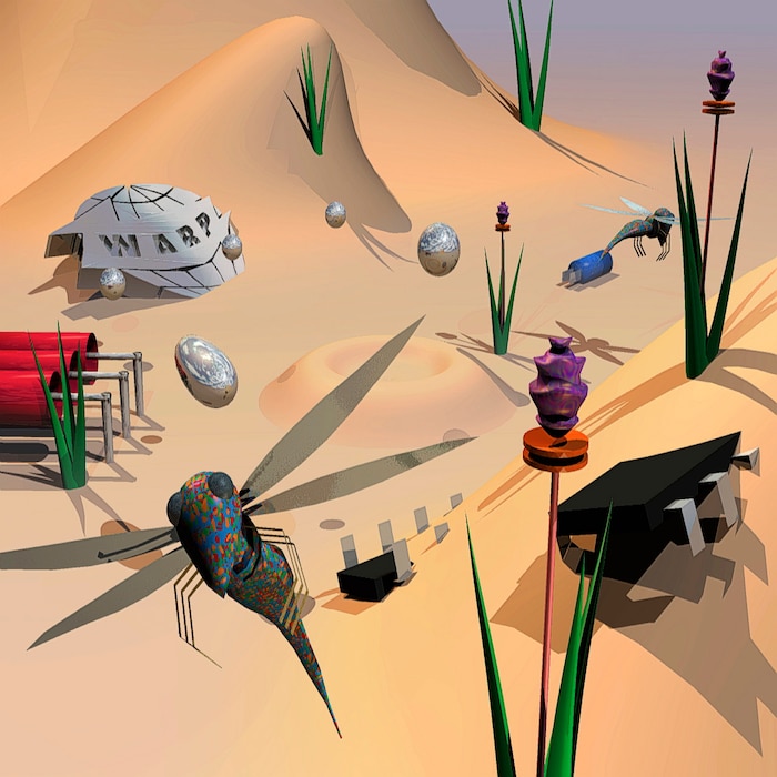
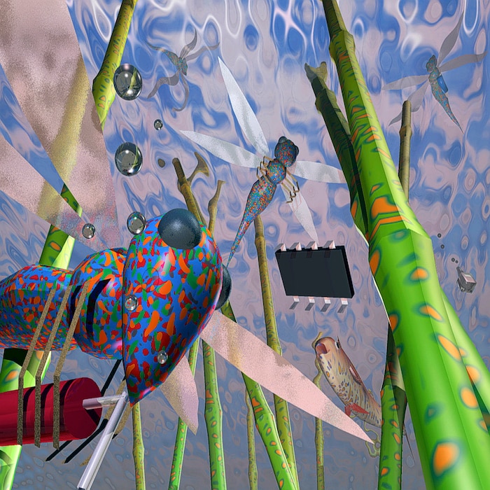
That cover seems like the beginning of the quintessential 3D computer graphics period you went through with Warp.
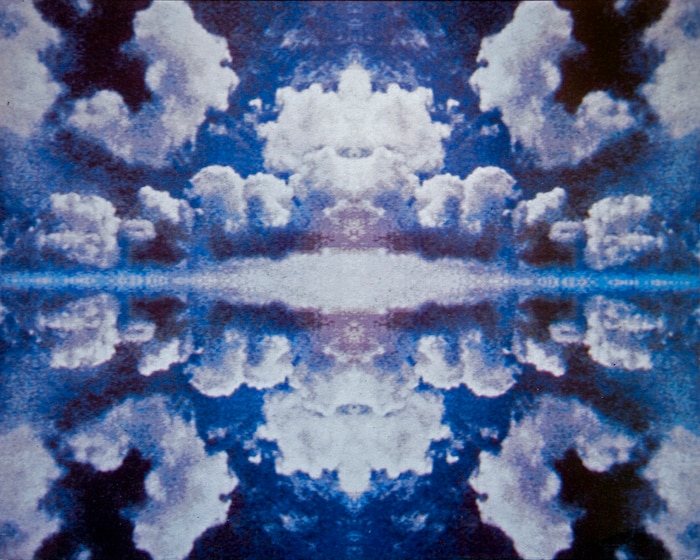
They specifically wanted circuit board components as 3D objects. I managed to construct this 3D landscape of resistors and various computer components, but then when I gave it to Designers Republic they ended up cropping it and blowing up a piece of it, and I was absolutely furious. I think they were just used to getting source material and doing what they wanted with it.
That series of sleeves led on to one of your most iconic, the cover for the Artificial Intelligence compilation on Warp. What was the thinking behind it?
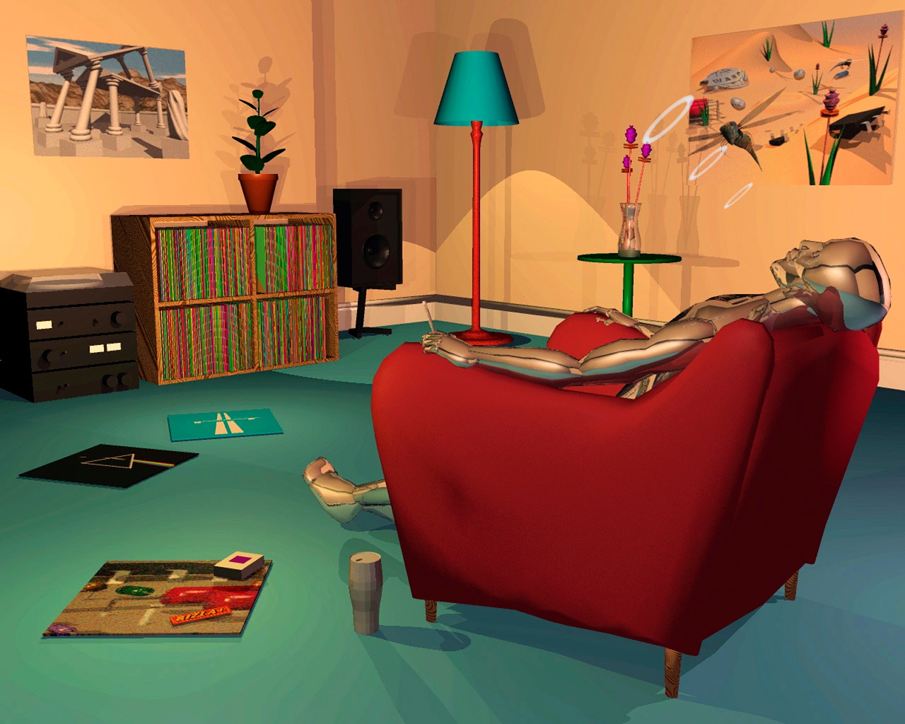
We sat down and had a big long chat about what we wanted to do. They wanted a robot figure of some kind, and I had this character that looks a bit like the Silver Surfer. They went, “That’s amazing! Let’s get him skinning up!” and it evolved gradually into this robot guy sitting at home listening to his albums smoking a spliff, which we just thought was hilarious, and then it started getting taken really seriously. Even funnier, a German techno compilation copied it, and they had a robot guy smoking a spliff in an armchair but done really badly. We were passing it around the Warp shop and howling with laughter, but at the same time there was this brilliant feeling of, ‘Oh my God, they’re copying us, we’re actually cool.’

Doing the cover for the Orb’s U.F.Orb was a sure sign that your cover designs were in demand.
I was absolutely mortified when that album came out, because they’d managed to print it with a brown tint that wasn’t there on the original. Because of the conversion issues between Amiga and Mac at the time, I’d had to put the image onto film, and they had it scanned, and somewhere in that process it came out brown. The spaceship in the original is very silver – it doesn’t look anything like the one that was on the sleeve.

Doing the Shamen’s Different Drum seemed like another more high-profile gig for you.
That came out of the blue, really. They just asked me to make this strange futuristic African drum. It was quite an interesting brief because I actually had an object to make in the way that you’d make a sculpture, but in a virtual style. It was really good for me because it made me try some new techniques. I was gradually getting better at computer graphics. More importantly, the software was getting better. There was a new program out called Imagine that was way ahead of Sculpt 3D that I’d been using before. It was actually fast enough to do 3D animation within a reasonable time frame, and that’s when we started getting the ideas for the video.
Are you referring to Motion, the VHS that accompanied Artificial Intelligence II?
Yeah, that’s right. I’d started it when we did the first one, because I’d already animated the robot guy exhaling smoke rings, and they [Warp] went, “Oh my God, we’ve got to make a video of this.” I said, “We’re going to need a lot more hardware,” and they just bought everything. It took about nine months in total to render everything that came from me. It was frustrating having to limit myself to things I knew I could do in a time frame. We did have to plan it quite a lot, and I had to reject quite a lot of stuff that I knew would take too long to render, to have a video out within a year. We didn’t want to miss the buzz, and it needed to come out with the next album.

When it was done we showed it at the ICA in London, and had to show it three times in a night because so many people turned up to watch it. There was a massive applause at the end, and even then I was thinking, “It looks a bit cheap to me,” but I was such a perfectionist I always wanted to do more than I could.
It seems like you quite quickly moved away from this focused period of sleeve design after Motion.
I was starting to move into software design. I got a job with a very small software company that were into animation production and soft object development, because that was the next big thing. Motion was definitely a one-off, because Warp didn’t have the production capacity to do that full-time. To keep buying hardware to set up an animation studio would have been ridiculous, and even at the time when Aphex Twin was getting going, he was making his own videos, and all the bands they were signing were bringing their own artwork, so it was inevitable that was going to finish as a regular employment for me.
Would you say the cover for drum & bass compilation Artcore in 1995 was one of the last of those ’90s CGI designs that you did?
I’ve done occasional stuff for Richard Kirk ever since, so I didn’t finish doing album covers, but certainly of the popular phase Artcore was one of the last ones, and it was one of the more complicated ones in terms of 3D, because I could make a lot more objects by now. I had more memory and more processor power, so I could start doing plants, which were much more complicated. The construction of 3D was really starting to piss me off ’cos it took ages to make anything look realistic. In some ways the nail in the coffin was when I found that you could buy 300 different plant models on CD for thirty quid that somebody in Germany would make. Then software came out that generated plants, and as it got easier and easier it also got more and more expensive.
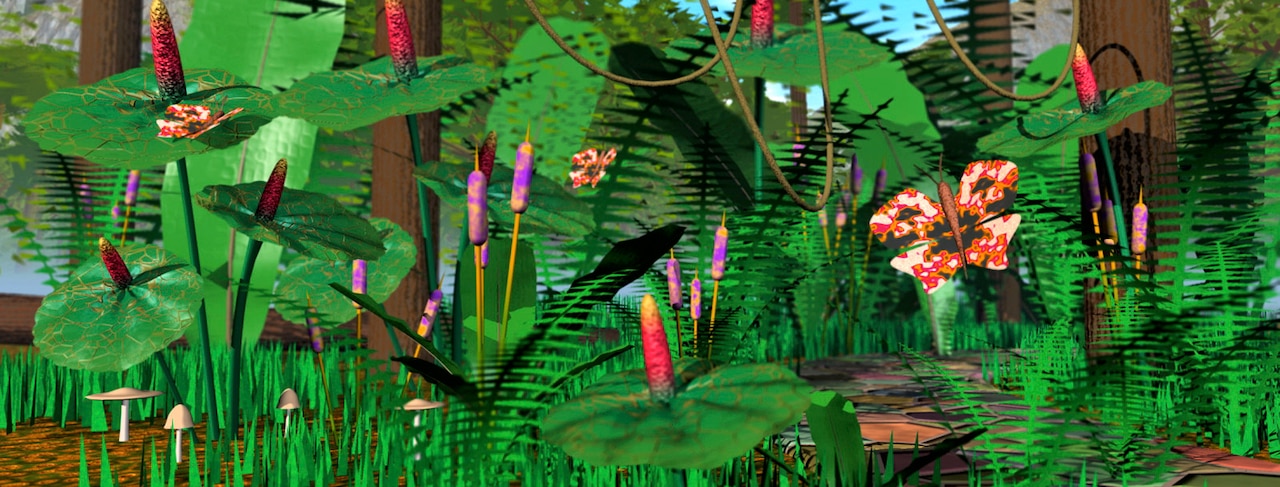
How do you feel about the work you did at that time, looking back at it now?
At the time I couldn’t do it to the level of detail and quality that I wanted, and it still felt a bit cheap to me. Looking at it now, it's easier to watch it with a nostalgic kind of, ‘Ah, ain’t that sweet?’ Some of it I’m looking at through my fingers like, ‘Oh God, that’s so bad,’ but that’s just the passage of time. When other people see it they go, ‘That’s amazing!’
