Strictly abiding by a “more-is-more” philosophy, the Brauch brothers shaped the visual aesthetic of Southern hip-hop’s flashiest era
In August 2009, Houston artist Chamillionaire released Mixtape Messiah 7, the final instalment in his self-released series. On the track “Successful,” Cham revisited his pre-fame self, with lyrics that are both a lament to his youth of poverty in 1990s Houston, and an up-yours to the female school peers who ignored him, despite his ambitions:
Hit the money spot, couldn’t pull no money out
Went to Pen and Pixel, asked to help ’em with the Photoshop
Knew the pictures wasn’t real, Pen and Pixel known to crop
Now they takin’ pictures of the drop when I unfold the top
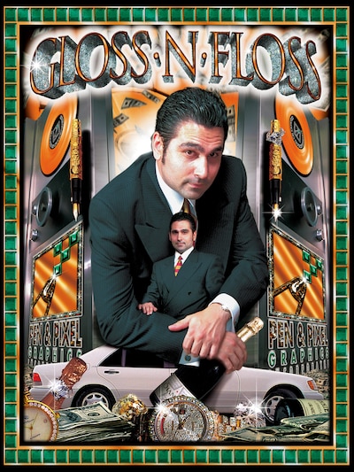
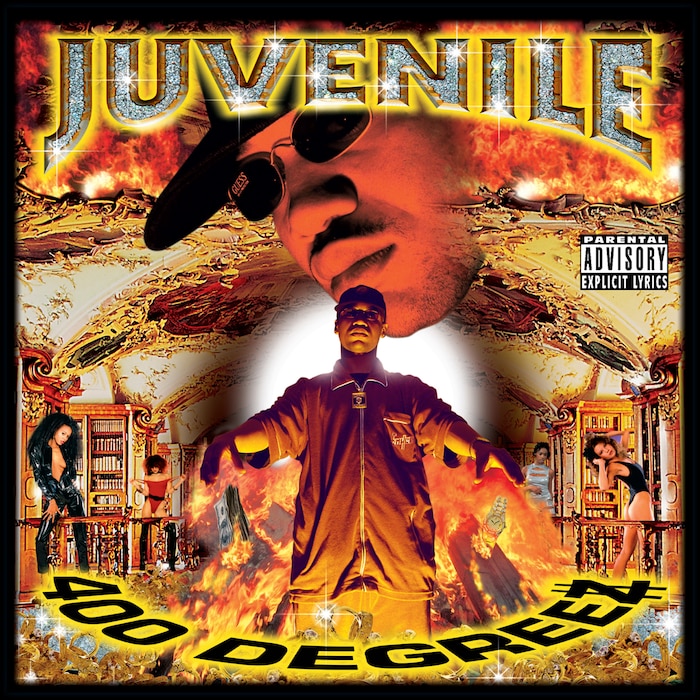
While the young Chamillionaire looked impatiently to his future, the Houston graphic design house that he namechecked, Pen & Pixel Graphics, was hitting its peak. Infamous for their unmissable album covers for the stars of Dirty South rap – Geto Boys, Juvenile, Master P, Lil Wayne and Mystikal, plus former Death Row affiliate Snoop Dogg on the West Coast – the look was unmistakable and outlandish, crude and disproportionate drag-and-drop layers that were gleefully unreal. The laws of gravity, physics and proportion simply didn’t apply. Every surface glittered and gleamed: champagne bottles, towers of gold coins, Disney-esque castles and European palaces, the sharp teeth of a panther, the ruby eyes of rottweilers who foamed at the mouth. Artist names called out boldly in three dimensions, aggressively encrusted with diamonds. Rappers leaned on gambling tables and yachts, slouched in thrones, perched on the hoods of luxury cars. At their most productive, Pen & Pixel were churning out upwards of 50 album covers a day.
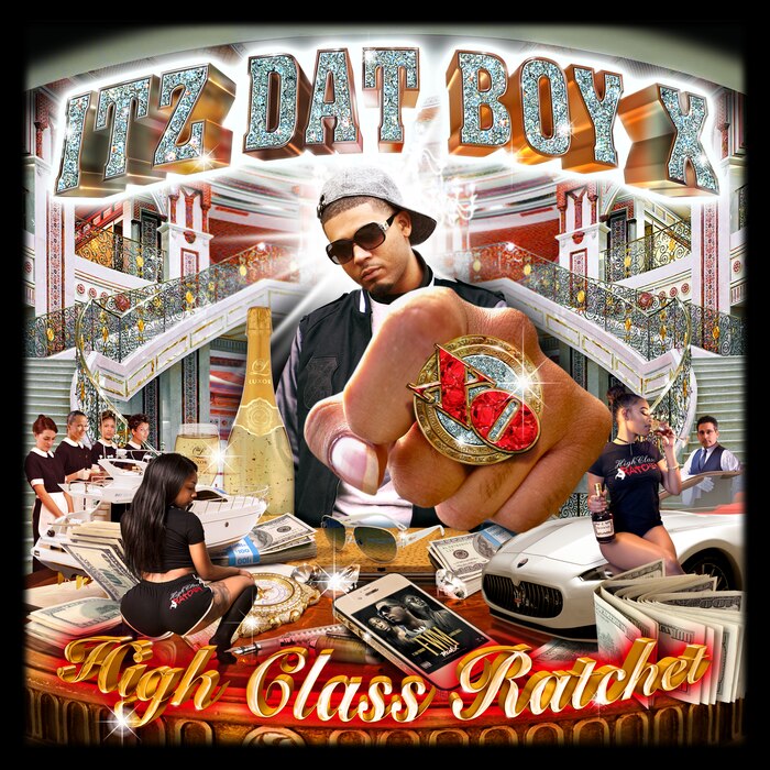
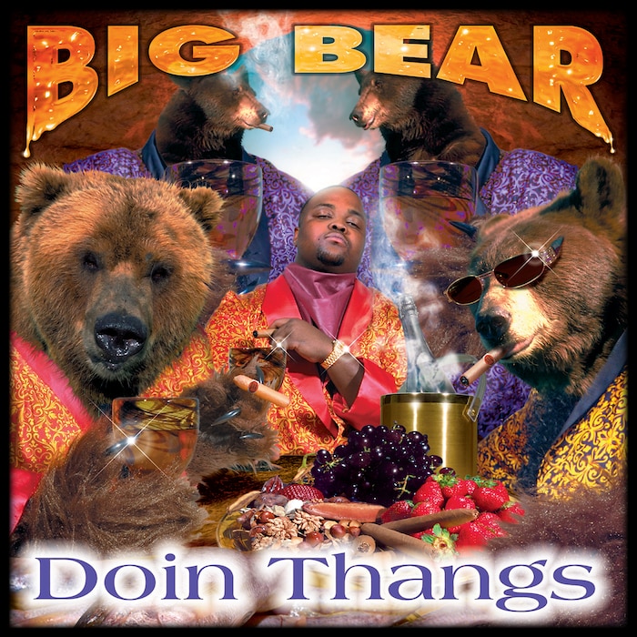
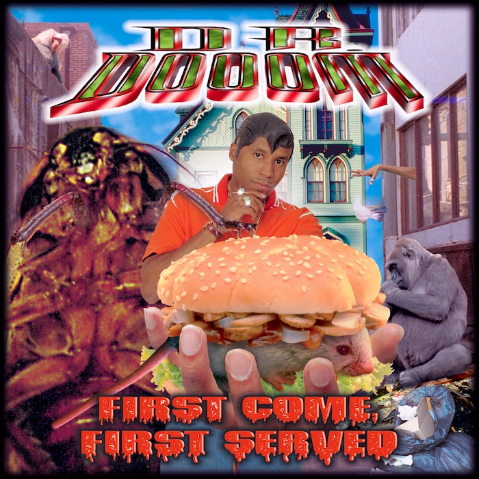
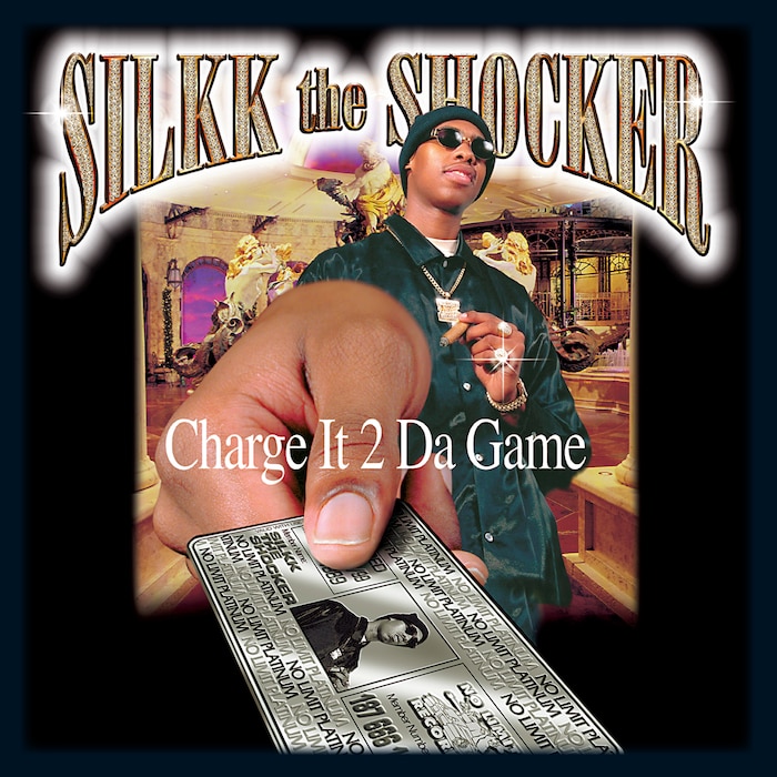
There is more than a hint of the absurd within their vast archive of covers stretching from 1992 to 2003. G-Funk trio PLUTO float in deep space in a drop-top convertible, while E.S.G. and his crew skim over an ocean in one. The bodies and hands of Atlanta’s C.M.P are replaced by the wonky, ring-wearing paws and slobbering heads of large dogs. Solo Slim literally stitches a post-apocalyptic world back together with a giant sewing needle, and Lil Flip has, mysteriously, taken on the persona of the Lucky Charms cereal leprechaun. Master P’s brother, Silkk the Shocker, cheerfully extends his arm towards the camera to complete a purchase, holding a gold “Ghetto Express” credit card for the cover of his album Charge It 2 Da Game. Noted eccentric Kool Keith worked with Pen & Pixel to parody himself and their aesthetic: For the cover of First Come First Served, by his alias Dr. Dooom, an oddly-positioned, superimposed hand grips a sandwich loaded with salad and a live rat, while a disembodied woman’s hand drops a napkin out of a window and a huge overturned cockroach looms over Dr. Dooom’s right shoulder.
While it’s tempting to try and divide Pen & Pixel’s rap artwork into two categories, “winking in-joke” and “deadly serious,” it soon becomes clear that it’s all executed with the same earnestness. New Orleans rapper B.G. stands amidst a trippy downpour of giant bullets on an impoverished street for Chopper City in 1996. Three years later he sneers while holding a mobile phone to his ear, surrounded by fabricated flashiness and bling on the cover of Chopper City In The Ghetto, while a framed portrait of himself, wearing the same sweater and chain, smiles and flips the bird. That album’s breakout single “Bling Bling” gave a term to the aesthetic and rapidly pervaded wider culture, landing in the Oxford English Dictionary in 2003. The early 2000s also saw Pen & Pixel’s signature design look commissioned by HBO, Cher, DreamWorks and Chris Rock.

America’s hip-hop success story narrative – self-made, from the streets to the charts to the boardroom – became a trope. The demographics of the high-volume rap music consumer shifted. Shawn Brauch, the art director and co-founder of Pen & Pixel, alongside his brother Aaron, identified it as “white, 14-year-old girls at the mall, spending their $40 every weekend on rap music to piss off mom and dad.” Markers of societal infamy and cultural currency became interchangeable. The lines between fantastical aspiration, real-life ostentation and caricature roleplay blurred, aided in no small part by the more-is-more Pen & Pixel aesthetic.
Not To Be Ignored
Photos of Aaron and Shawn Brauch from Pen & Pixel’s heyday portray two men in the mould of the Baldwin brothers, straight out of ’90s executive central casting: dark-haired, well-groomed, elegantly suited. Shawn, over the phone from his home in Florida, recalls the first meetings he’d take with artists at the company’s Houston office. “They were fascinated because they’d walk in, meet me, and they’re like, ‘You’re a white guy.’ I was like, ‘Wow, Captain Obvious. I am, and you’re a black guy,’ and they’d start laughing. Right then, that rapport was set, like, ‘OK, this guy is cool.’”

The Brauch brothers were both born in the United States, only 11 months apart, but spent their childhood and adolescence on other continents. “We were raised in Tokyo, Singapore, Hong Kong,” says Shawn. “We were in the British school system our whole lives. I graduated from Escola Americana in Rio de Janeiro.” Aaron, the elder of the two, returned to the States in 1980 to study computer science, eventually earning a master’s degree in business at Cornell University. He is, Shawn says, “a highly technical, highly business-oriented type of guy.” The following year Shawn forged his own creative path enrolling at the School of the Art Institute of Chicago, then at Parsons School of Design in New York.
Shawn gave a totally underserved, underutilized and underappreciated people, this entire genre of music, an aesthetic, an artwork and an art style that could no longer be ignored.
Their divergent paths appeared to be set, until a former classmate of Aaron’s told him about a business opportunity too good to ignore. Cliff Blodget, a computer technician and passionate audiophile, had relocated to Houston. There he’d connected with James Smith, AKA Lil J, a budding recording impresario who worked with local groups in a makeshift space above the car lot he operated. Smith and Blodget founded Rap-A-Lot Records, with Blodget serving as the labels in-house engineer and producer. One of the local Houston acts that James championed – the bloodthirsty Ghetto Boys, later Geto Boys – had been generating heat with their 1989 sophomore album Grip It! On That Other Level.
“[Cliff] figured out how to create music much less expensively than having a recording studio,” says Aaron, over Skype from his home in Chicago. “He said ‘We can do it using MIDI technology, for $15,000 to $30,000. One-tenth of the price. What we need is a general manager, to sell this stuff and organize this company.’” Aaron relocated to Houston to join the Rap-A-Lot fold. A year later he called Shawn, who was working in commercial advertising in New York. The younger Brauch had already let it be known that he found Rap-A-Lot album artwork to be seriously lacking. Aaron invited Shawn to Houston, to lend his design expertise; with nothing much to lose, he accepted.
“It was pretty clear,” recalls Aaron, “that this music was going to force its way into the marketplace, whether the music industry liked it or not.” The elder Brauch is a man of unflappable poise – he now works as a Tony Robbins-accredited life coach, a management consultant and a business expert. But towards the end of the call, his demeanour shifts a little, and he gestures a little more emphatically when speaking specifically about the purpose of the visual work that Pen & Pixel created.
“Shawn gave a totally underserved, underutilized and underappreciated people, this entire genre of music, an aesthetic, an artwork and an art style that could no longer be ignored,” he says. “The music was incredible, don’t get me wrong. But, man, his artwork was definitely a contributing factor to a lot of those gold and platinum records. And to the way they felt about themselves. We did not come from American culture. We did not have the bias. Because we were also the minority.”
On Top Of The World
Shawn’s first assignments as Rap-A-Lot’s art director included getting to grips with the latest developments in computer-aided digital design. “Rap-A-Lot had been outsourcing a great deal of the special effects, if you want to call them that,” says Shawn. “It was basically paste-up, you physically get the stuff and stick it. They were doing so many album covers and adverts that their bills were $20,000 to $40,000 a month in computer layout charges. So Lil J bought the Apple Macintosh Quadro 900, the best system that was available in Houston at that time. The software was astronomical, the scanners were astronomical, the printer was like $2,500 for a basic bubblejet. We had a couple of people in the art department, and we started pushing it and pushing it and seeing what we could do. We would spend hours and hours on that machine after work, trying to figure out Photoshop and figure out freehand.”
The cover of Willie D’s solo album I’m Goin’ Out Lika Soldier was a major breakthrough. It was a musical shot fired at his former bandmates in the Geto Boys, from whom he had become bitterly estranged, and a rebuke of moral panic and censorship around so-called gangsta rap. “That cover put Rap-A-Lot on the map in the sense of special effects,” says Shawn. “He had a political message, so we burned down the White House. It was all red and fiery, and it looked good for 1991. That’s what started bringing artists to Rap-A-Lot.” The future Pen & Pixel hallmark of building a catalogue of images of singular objects, which could then be selected like options off a menu, became systemised.
The Brauchs began to hear through the Houston grapevine about artists who had tried to connect directly with the Rap-A-Lot art department. They loved the look of the album covers, but didn’t necessarily want to sign to the label. Lil J would reputedly throw these enquirers out of his office. The brothers developed a proposal for their label’s head: They would set up a standalone art department under the Rap-A-Lot umbrella, use the label’s top-of-the-line equipment to fulfil these direct requests, and kick a commission back up to Lil J from each job. Lil J’s counter-proposal was harsh: He wanted an 85% cut.
“Aaron and I sat down, and he’s like, ‘You gotta tell me the truth, how many people are asking for these types of covers?’ recalls Shawn. “I was like, ‘50 people are asking, and they have cash.’ So we did a business plan, laid it all out. Aaron’s like, ‘OK, this is viable. Let’s give it a shot.’ We went out and bought the identical system we’d been working on. We set it up in our apartment on our dining room table. We quit Rap-A-Lot. And that’s how it started.”
Pen & Pixel got off to a rocky start. “I think our first project was a jewellery company, a Christmas catalogue or something like that,” recalls Aaron. “The technology was not there to be able to do that level of resolution, it was not technologically possible. That almost drove us out of business.” Low-res gemstones would eventually become their calling card, but first they needed to make some easy money. They decided to focus on music again, and Shawn began churning out generic digital-art album covers for small-scale Tejano, country & western and Christian acts, while Aaron’s systems analysis streamlined the process to become more template-driven and efficient. “We would do 60 or 70 a day,” recalls Shawn, “setting it up, printing it, and selling it back to the record companies. Eventually, we ended up hiring people and that’s all they would do, put out 50 covers a day at $100 apiece.”
Shawn dabbled with adding special effect extras for particular jobs. “We’d knock the guy out and put a car behind him,” he says, “maybe we’d put some ladies behind him. Or change his head out, put him in a suit. People loved it.” More doors at more record labels opened, but it was Houston rap impresario Tony Draper, who had founded the Suave House label at the age of 16, who was the catalyst for the exaggerated Pen & Pixel aesthetic. “He was like, ‘Let’s push this a little bit further,’” says Shawn. “We did the first album for Suave House, Eightball and MJG’s Comin’ Out Hard, the one with the Lexus [convertible] going across the city skyline. That was the first coupe that Lexus ever put out, but he wanted it to be a convertible. So we shot the guys in a Mustang, pulled them out of the Mustang, put them in a Lexus, cut the top off and put it in front of the Houston skyline. When people saw that, they were like ‘Wait a minute, Lexus doesn’t make a convertible. How did you get it?’ We started getting way more three-dimensional after that. Tony Draper really cracked that nut open for us.”
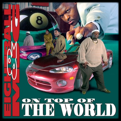
Shawn’s follow-up album cover for Eightball and MJG, On Top Of The World, was an ambitious pool table tableau of the duo’s body positions perfectly reflected on unusual surfaces – a giant snooker ball and the gleaming hood of a Dodge Viper – both of which would be added in post-production. Shawn befuddled the photographer who was hired to shoot the two rappers, who posed for both the portraits and for the staged reflections. “Tony would advertise in The Source and Rap Pages Magazine,” says Shawn. “Back then, the readership was 200,000, 300,000. People saw that, record companies saw that, and our name was under it. The phone just started going crazy.”
“We grew so quickly, there just wasn’t any competition,” says Aaron. “I mean, Warner Bros. and Capitol Records had their own art departments, but we were on our own. There weren’t any independent graphic design firms that were anywhere close to what we were doing, especially as far as the music industry was concerned. We were a force of nature, in and of ourselves.”
Overloaded Pizza
Shawn considers the best years of Pen & Pixel to have been the first five. At this time America’s bi-coastal rap feud had turned tragically bloody, and Southern rap’s profile was growing, but Atlanta hadn’t yet replaced Houston as the eye of this storm. Cash Money Records was on fire. He recalls meeting a baby-faced Juvenile for the first time and mistakenly assuming Lil Wayne was someone’s young child.
“The most profitable years,” Shawn continues, “were 1998 to 2000. Those years were insane. It just kept building and building, and before you know it, it was like an overloaded pizza.” Pen & Pixel had vertically integrated into a one-stop empire. Upselling was a crucial part of their business model, with separate sub-brands and departments dedicated to every step between recording demo and selling a finished product in a record store. These businesses included a printing facility, photography studio, CD and cassette manufacturing, a mastering and sound editing lab, music video production, distribution networks, concert set-ups, personal security, hotel and flight reservations, and Pixel Music Television, a locally-produced music TV channel.
A particular kinship was formed with Master P’s highly prolific No Limit Records, which flooded the rap music market with weekly releases, sometimes packaged in opaque, brightly-hued plastic CD cases, designed to grab attention from a distance. “Like my brother, Master P is a systems guy,” says Shawn admirably. “He would use the formula of packing as much value into a CD as he possibly could. 24 tracks by 15 different artists with seven different guests. He understood that formula usually led to sales, even though there would be only one or two hits on there. People obviously had to buy the whole $40 album. His logic was, if I’m going to put out one album, I might as well advertise the next 14 albums and put the images in there, so when people go to the store, there’s no confusion. He would come to us like, ‘I need these next 12 covers done.’ I go, ‘Have you recorded it?’ He’s like, ‘Of course not.’ That in itself elevated P to the next level.”
People would comment later, “Yeah, man, the album wack, but the artwork was cool.” I was like, “Well, that’s my job done, right?”
In turn, Shawn refined his own design formula: The person drawn to the newest No Limit CD, by it’s fire-engine red case, would form a further level of attachment to it while their eyes attempted to take in all of the outrageous, garish detail. “We spiral your eye, which is called eye control,” he says. “That’s something I still do to this day. I want it to spiral from right to left, and spiral in. That action takes a bit of time. The longer you hold that CD cover in your hand, the more possession-oriented you become. People would comment later, ‘Yeah, man, the album wack, but the artwork was cool.’ I was like, ‘Well, that’s my job done, right?’”
A-list clients came calling, and Shawn linked in with faculty from the Art Institute of Houston to find talented graduates to staff his department. He wanted the best of the best, and, specifically, those with comic book experience. That particular drawing discipline was perfectly suited to Pen & Pixel first contact-sketching meetings that would help draw an artist into the Pen & Pixel machine: They could sketch fast, weren’t bound by laws of realism and bigger was always better. Shawn recalls only one client request that they couldn’t – or rather, wouldn’t – fulfil. “A couple of guys came in. Insane Clown Posse,” he says. “They had a concept, it had to do with shooting a woman, and she was pregnant. We asked them to leave.”
Smartface
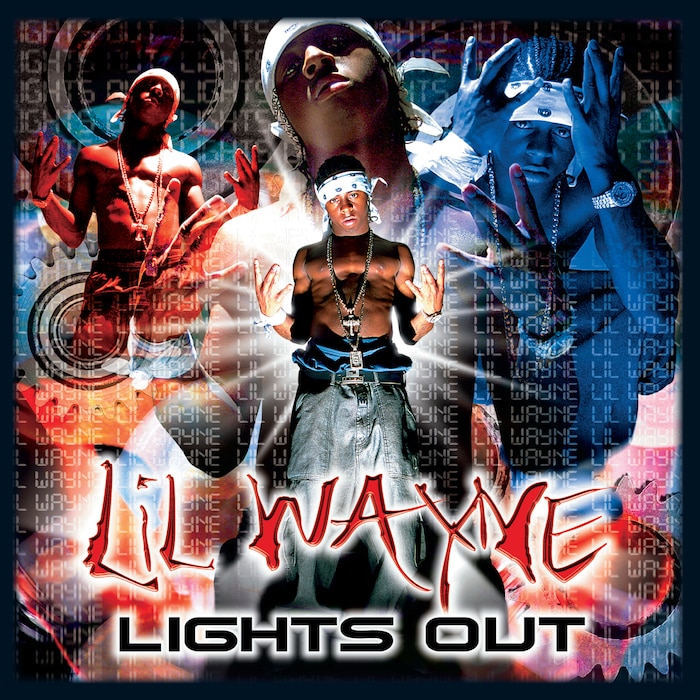
Pen & Pixel’s material excess aesthetic began to tarnish around the turn of the century. A sleeker, more futuristic approach – appropriately called “The Millennium Look” – was adopted by some of Pen & Pixel’s marquee clients. “Juvenile’s Project English, Mack 10 [Bang Or Ball] are good examples,” says Shawn. “Lil Wayne’s Lights Out. It’s more of a movie poster look, almost monochromatic, maybe duochrome. After 19,000 covers we’d pushed every concept we possibly could with bling bling. We were running into a wall, and we wanted to keep it fresh, because in the music industry, if you don’t keep it fresh, you’re gone.”
Shawn began to become aware of an online platform, Napster, which allowed anyone with an internet connection to share and download music files. While he was perturbed, his brother was fatalistic. “The first time I saw somebody download an album or a song online,” says Aaron, “I think was Napster at the time. As soon as I saw that technology, I was like, this is over. The erosion wasn’t happening yet in rap and hip-hop and Tejano because they were slightly behind the curve from a technology standpoint, but it was pretty clear that this was going to be a problem. I was like, ‘We need to exit this business. I’m not big on running a business all the way into the ground.’ Even if they solved the music download problem, it still didn’t solve the Pen & Pixel problem, because we were in artwork but most of our money was coming vertically.”
Between 2001 and 2003 Pen & Pixel reduced their team to a skeleton staff, but they still burned through the company’s cash reserves, as illegal and legal music downloads began to outstrip CD sales. The decision was made to close the business, and transfer the company’s work files to the last three remaining employees, so they could create their own small design studio to maintain Pen & Pixel’s work relationships, albeit on a smaller scale. But after a couple of years that team dissolved, and ownership of the Pen & Pixel URL lapsed. Another company now operates as Pen & Pixel, much to the Brauch brothers’ chagrin.
In the intervening years, Shawn created Smartface Media, a design business which works primarily in the world of high-end art brochures and trade shows. He still takes the occasional album cover commission, and appreciates that the frenetic pace of Pen & Pixel’s heyday is in the past. “I think the work that I’m doing now is actually some of my best,” he says, “because I have that time. You sit down for a week and a half, two weeks, on one project and put every single detail in there.”
The slower pace of life has also allowed space for the brothers to deeply consider the cultural impact that Pen & Pixel had, as a distinct visual storyteller. “One of the things that sort of woke us up,” says Shawn, “was when people were starting to put Pen & Pixel into the lyrics of their music. If you’re going to ‘pen and pixel it,’ you’re going to bring it to the next level, you’re going to be so wealthy or so outlandishly opulent that you’re going to show it off. You’re going to be driving in your Rolls-Royce with a stack of cash. You’re going to have four Rolex watches, some honeys on the back, you know, that whole thing.
“We once had a client who got his first royalty check, which I believe was like $960,000. He goes down to Rolls-Royce of Houston. They had three Rolls-Royces on the showroom floor that were all platinum-coloured. Rumour has it that he signed over the check. He was 16 years old at the time, didn’t have a driver’s license! He had to have all of his friends come and drive the cars off the line. He made that album cover his life.”
Header image © Shawn Brauch / Smartface Media
