The Sandpaper Cover of The Return of the Durutti Column
Louis Pattison explains the backstory behind the infamous Factory Records sandpaper sleeve, and how one man tried to recreate it.
In January 1980, Factory Records released The Return of the Durutti Column, the debut album by The Durutti Column. A group assembled by Factory directors Tony Wilson and Alan Erasmus, come 1980 The Durutti Column was just one man: a guitarist named Vini Reilly.
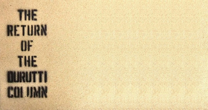
Reilly had played in Manchester punk group Ed Banger And The Nosebleeds, but the music on The Return of the Durutti Column owed nothing to that genre, save perhaps a desire to non-conformity. Nine tracks of mercurial, jazzy solo guitar, augmented at the post-production stage by modular synthesizer played by Factory’s in-house producer Martin Hannett, it was remarkable music. But every bit as remarkable was its packaging: sleeve pasted with two slabs of heavy-duty sandpaper, and – on some copies, at least – spray-painted with the catalogue number, FACT 14.

The Return of the Durutti Column could be seen as an explicit declaration that Factory Records had some lofty intellectual ideas. Both title and sleeve made direct reference to the work of the Situationist International, a mid-20th century group bent on disrupting “the spectacle” – their term for a manifestation of advanced Capitalism, an accumulation of pseudo-images that invented false desires and stifled authentic, lived experience. Little in Reilly’s sparkling guitar miniatures spoke of revolutionary intent. But his beautiful, blank music offered a canvas for Factory – specifically, label co-founder Tony Wilson – to circulate ideas that had served as inspiration for the imprint from its beginning.
When Tony [Wilson] mentioned to me a book with a sandpaper cover that violently damaged your other books, I thought, “Yes, that’s a powerful, iconoclastic gesture.”
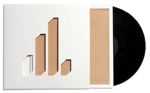
Factory released four editions of the sandpaper-bound Return, totalling 3,600 copies, and in June 1980 the album was reissued in a more conventional sleeve, featuring a painting by Fauvist artist Raoul Dufy. For the first time in 30 years, then, 2014 sees FACT 14 back in sandpaper. In December 2013, Factory Benelux, the label now curated by James Nice of LTM Recordings, announced a new limited edition of Return. Nice has conceived an updated design setting an 11-inch square of sandpaper beneath a die-cut based on the 1978 Factory bar graph logo conceived by Peter Saville, with a hard vinyl 7-inch of additional tracks replacing the original “test card” flexidisc. The whole package is housed in a protective polythene wallet. (Some of the revolutionary intent is diffused, but at least your vinyl collection won’t bear the brunt.)
Nice, taking advice from Saville and Durutti Column drummer/manager Bruce Mitchell, has been working on this new edition since 2010. For him, the revival of such lost artefacts is a sort of public duty. “It seems to me that the sandpaper Return… is second only to Metal Box in terms of radical post-punk packaging,” he says. “FACT 14 is an ugly/beautiful object, and the abrasive outer cover stands in pleasing opposition to the music contained on the record inside. Plus several memorable soundbite stories are attached to it – that it destroys all the other records around it, or that Joy Division put them together for tuppence ha’penny. That it’s Situationist, whatever that means.”
Talking about it today, though, it’s clear Saville still has a complex relationship with FACT 14. “When Tony mentioned to me the Dadaist proposition of a book with a sandpaper cover that violently damaged your other books, I thought, ‘Yes, that’s a powerful, iconoclastic gesture.’ And I also saw how it could be transposed or transported to the format of a record cover. But I did feel, even just instinctively, that there were some aspects of it that were incompatible with itself.” He laughs. “Sandpaper and vinyl records… it’s not the most comfortable partnership.”
INSPIRATION
The sleeve of FACT 14 has a direct inspiration: the 1959 book Mémoires, a collaboration between Guy Debord – the French intellectual and de facto leader of the Situationist International – and Danish artist Asger Jorn. The inside of Mémoires is striking, a collage of cut-up texts, maps, cartoons and newsprint, splattered with coloured ink. It was the sandpaper jacket of Mémoires, though, that would resonate: designed to damage or destroy the books around it, the surface it was placed on, even the reader.
In 1959, the Situationist International were but two years old, just a handful of thinkers drifting the bars and cafes of Paris’ Left Bank. Their ideas, though, would soon attain startling potency. The Situationists were starry-eyed utopians, ruthless critics and prolific creators. Their films, books and philosophical pamphlets re-smelted shards of earlier 19th and 20th Century artistic and political movements – Surrealism, Marxism, Lettrism, Dada – into calls for spontaneous artistic play and increasingly, civil insurrection.
The dope-smoking hippies of the UK counterculture were not natural bedfellows for the likes of Debord – French, intellectual, preferring red wine and cheap cigarettes.
Come 1967’s Society of the Spectacle, Debord’s critical theory hardened into a road-map for action. The book called for the state’s power to be devolved to collectivised worker’s councils. A year later, the Situationist International’s ideas and slogans were fuel for the May 1968 uprisings in Paris, where institutions were immobilised by wildcat strikes, barricades were erected in the streets, and Situationist-inspired slogans (“Drive the cop out of your head,” “Never work”) were spray-painted on the walls.
Come the late ‘60s, Situationist thought arrived in the United Kingdom. The dope-smoking hippies of the UK counterculture were not natural bedfellows for the likes of Debord – French, intellectual, preferring red wine and cheap cigarettes. But several Brits, such as Christopher Gray and Charles Radcliffe, founders of radical journal Heatwave, briefly moved within SI circles. Blending Situationist dialectic with a British pop cultural vocabulary, issue one of Heatwave pictured mods and rockers clashing on Brighton beach, while joint pamphlet The Revolution of Modern Art and the Modern Art of Revolution earmarked The Who’s phony revolution: “The same old careerism in the same old rackets.”
After splitting from the Situationists in 1967, Gray, Timothy Clark and Donald Nicholson-Smith formed the West London radical group King Mob. Inspired by anarchist groups like The Motherfuckers, King Mob had a sense of humour the SI lacked. In December 1968, they staged a guerrilla action in Selfridges department store in which a member dressed as Santa passed out toys to passing children, while an occupation of the London School Of Economics saw sexually explicit cartoons plastered on walls. Moving in the orbit of King Mob were Malcolm McLaren – then a penniless art student, later to channel his Situationist learnings into the music industry as manager of the Sex Pistols – and Jamie Reid, who would make iconic artwork for the Pistols, most notably the defaced Queen Elizabeth II with a safety pin through her lip.
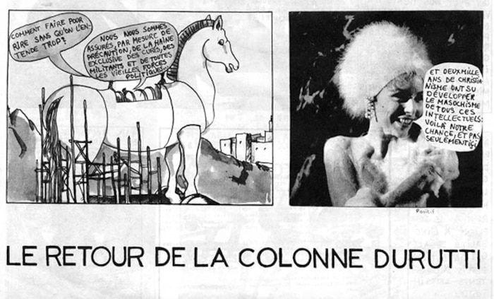
Tony Wilson’s introduction to Situationism came at Cambridge University, where he came into contact with radicals through a student group called the Kim Philby Dining Club. In 1969, Wilson met members of King Mob in London, where he was introduced to Le Retour de la Colonne Durutti (Return of the Durutti Column), a Situationist comic by Andre Bertrand that had been distributed around Strasbourg University, after Situationist-influenced students infiltrated the student council. Wilson, cultured with an eye for the iconoclastic, was impressed. “We all wanted to destroy the system but we didn’t know how,” Wilson said in 1995. “The Situationists offered, I thought then and I still think now, the only future revolution I could imagine or want.”

REALISATION
Situationist references pop up throughout the Factory story. Manchester superclub The Haçienda was named in honour of a phrase from Ivan Chtcheglov’s essay Formulaire Pour Un Urbanisme Nouveau, which was reprinted in Christopher Gray’s English-language anthology Leaving The 20th Century: The Incomplete Work Of The Situationist International. Stockholm Monsters took their name from the Swedish youth riots of 1956, while the Liverpool band Royal Family And The Poor made use of Situationist texts on records like 1982’s Art Dream Dominion.
The Return of the Durutti Column, though, was the first manifestation of Situationist influence in the Factory catalogue. It wasn’t always planned as such: James Nice says that Wilson told him that FACT 14 was originally to be packaged in a metal film canister, an idea thwarted by the release of PiL’s Metal Box in November 1979. The idea to use sandpaper came via Jamie Reid, who at the time was dating Margi Clarke, Wilson’s colleague at Manchester TV station Granada, and introduced Wilson to a sandpaper copy of Mémoires.
Saville’s approach with Factory, he admits, tended towards “a sort of coffee table subversion… seductive, rather than confrontational.”
Reid is thanked for “the marketing concept” on the sleeve, alongside Debord – one cannot imagine the Frenchman would have appreciated such a credit – and Dave Rowbotham, former Durutti Column guitarist, later immortalised by Happy Mondays as “Cowboy Dave.” One person not involved with the record’s packaging, however, was Vini Reilly himself. Indeed, Reilly – a shy and depressed figure who had to be coaxed into the studio by Wilson – had little idea the studio sessions were even to be worked into an album until Wilson presented him with a test pressing.
Saville, just a year or so out of art school, but with increasingly clear ideas about how Factory releases should look, was apprehensive. For one, he thought it a bad idea to mix sand grains with the soft grooves of vinyl. And while he appreciated the iconoclasm of it all, his approach with Factory, he says, tended towards “a sort of coffee table subversion… seductive, rather than confrontational.” Saville suggested the use of emery paper, similar but more durable and visually appealing. “The various shares of grey to black, from fine to granular, was very in keeping with the Factory aesthetic. But Tony said, I’ve already bought the sandpaper. So I became arm’s length at that point. I didn’t engage with any of the issues around making that sleeve.”
Wilson acquired 4,000 12-inch square sheets of sandpaper from Naylors Abrasives in Bredbury, near Stockport. The assembly took place in Alan Erasmus’ apartment. Members of Joy Division and A Certain Ratio were offered £15 each to attach the sandpaper sheets to 2,000 sleeves using wallpaper paste. Reportedly, Ian Curtis, the only member of Joy Division with a wife and child, took on his bandmates’ shifts while they watched a porn movie in Erasmus’ front room.
Reportedly, Ian Curtis took on his bandmates’ shifts assembling the sleeve while they watched a porn movie in another room.
Saville was unimpressed with the results. “To me, it looked like a DIY thing that was, really, the antithesis of what I was trying to do. It looked a bit homemade. My premise, with Factory, was that we would be independent, but we would do things better than the big manufacturers. I wanted to place culture or art in the possession of – I don’t want to call them ordinary people, but people not privileged to own art. I thought, why can’t pop things be smarter, more cultured, better?”
Saville may have had a point. Jamie Reid, who proofed FACT 14, recalls that Wilson paid him for his work with a half-dozen copies, all of which fell apart.
RE-ENVISAGING
Peter Saville may have had misgivings about the sleeve of FACT 14, but when James Nice approached him for the blessing to prepare a reissue, he was intrigued. “I knew it had become a cult object, and when James came to me, there seemed to be a certain logic there – I thought maybe it can be done better this time. Getting unusual or unique packaging done is obviously much easier than it was 35 years ago. Although as it turned out, he’s run into issues as well.”
At first, Nice intended to try to replicate FACT 14 as closely as possible, and hunted down Naylors Abrasives, the Stockport company Wilson had used 30 years previous. “They still exist actually,” says Nice. “But they don’t manufacture sandpaper any more, and when I explained the project they clearly thought I was a lunatic. I’m not sure that sandpaper is even manufactured anywhere in Western Europe now. In the end we had to go to a company in China, whose minimum order was 10,000 sheets.”
When I explained the project they clearly thought I was a lunatic.
What was a cheap and fairly easy package for Factory to create 30 years ago, says Nice, turned about to be almost impossible to copy in 2014. “It’s probably easier to source sandpaper in lurid colours rather than plain old beige, and the biggest rolls were only 11 inches wide,” says Nice. “You can still source flexi-discs from one plant in the States, but they end up costing more per unit than a 12-inch vinyl album. Fortunately, however, not being able to do a straight copy served to liberate the project somewhat, so that we began to think in terms of a new edition which referenced the original, but offered something different.”
So FACT 14 evolved. The flexi became a hard vinyl 7-inch, with improved sound, and while the squares were being shipped from China, designer Carl Glover came up with the idea of seating the sandpaper on the front in a recessed deboss – “a bit like a frame, thereby underlining the ‘art’ credentials,” says Nice. Pressing plants, meanwhile, struggled with the idea of why anyone might want to release a record in a sandpaper sleeve. “One suggested a photo of some sandpaper might be better,” says Nice.
Eventually, Nice decided to present the sandpaper through a die-cut, using Peter Saville’s original bar chart logo, which graced the labels of most Factory releases between 1979 and 1980. “It just looks right, and is also suggestive of a graphic equaliser, which I suppose is a bit Hannett,” says Nice. In honour of Saville’s aborted idea, Nice is also planning a special limited edition of ten emery sleeves. “He’s found ten different colours of industrial grades of emery paper – there’s a yellow, a quite bright green, a maroon, a black,” says Saville, who will be authenticating each one with a unique certificate.
Nice is delighted with the result. “The finished package looked even better than anyone dared to imagine, and housed in the polythene bag, it has a fantastic 3D quality. I was particularly pleased that Vini Reilly liked it. All the various headaches improved the design, and the addition of the die-cut means that you now have this unique Reid/Saville hybrid.” Truly, a happy accident. “These are almost memorials,” says Saville. “It’s not big business, but it’s nice there are people out there who’ll go, ‘There’s a few thousand out there who’d like that,’ and make a limited edition. James is doing honourable work.”


