The Genius of Graphic Designer Barney Bubbles
When we think of British graphic design and music packaging, some names spring immediately to mind: Peter Saville, Malcolm Garrett, Hipgnosis. Yet, until recently, the work of Barney Bubbles, a great and noted influence on the work of Saville and Garrett has been ignored.
Barney Bubbles defined the look of the British psychedelic movement of the ’60s, then seemed to recede from sight. He resurfaced a few years later, helping to establish the aesthetic of British punk, then did the same for post-punk. So, why isn’t he remembered in the same way as Saville, Garrett, and Hipgnosis? Bubbles signed almost none of his work – and, when he did, he utilized an arsenal of assumed identities, each equally absurd and non-sensical.
Before he became known as Barney Bubbles, Colin Fulcher studied a mix of illustration, photography, typography and graphic design at Twickenham College of Technology, and produced award-winning design work as a student, including a British Poster Design Award for a poster he created for college band The Muleskinners. After graduating, he worked at Conran in their design department for a few years before becoming a freelancer and setting up his own studio, first alone, and later with the backing of two con artists who acted as hybrid agents/PR men, with friends under the banner of “Teenburger,” until the con men’s illegal activities shuttered it, and Barney was back out on his own again, this time laden with debts foisted upon him by his agents.
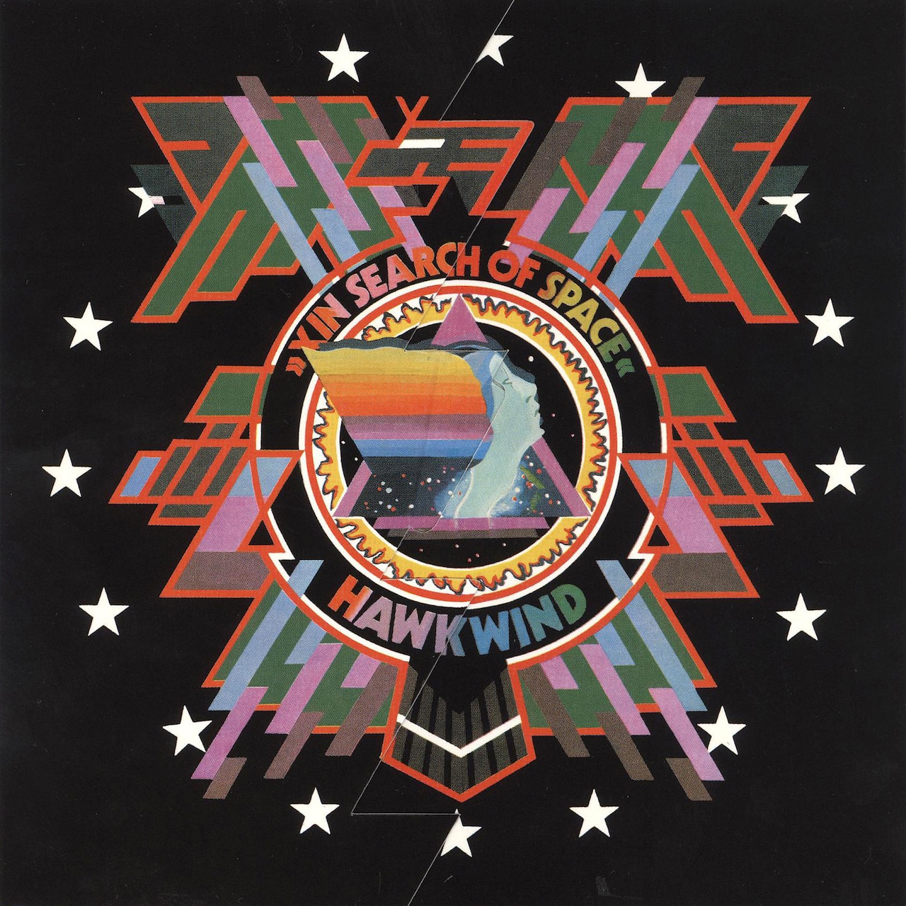
As luck would have it, Fulcher, now going by Barney Bubbles – a moniker acquired due to his oil-and-ink projection light shows for psychedelic concerts – wound up in the frequent company of the band Hawkwind, for whom he would design the classic album X In Search of Space, alongside numerous other albums, choreography, tour material, posters, and ephemera. Bubbles’ design work would help define the band with its visual mix of science fiction comics imagery, art history reference, terse lettering, metallic finishes, and astral graphics.
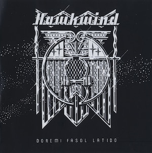
His design for the subdued, irreverent Hawkwind album Doremi Fasol Latido brought other influences to light – the architectonic furniture of Charles Rennie Mackintosh; streamlined, modern car grilles a la Raymond Loewy; and a dark sense of iconography reminiscent of fascist icons and architecture. Bubbles’ designs presaged the visual style of countless progressive rock and krautrock designs by pairing the atmospherics of Hawkwind with a look for the machine age, simultaneously dehumanizing and supplementing the music with an aesthetic of true futurism.
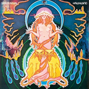
Bubbles’ album design for Hawkwind’s Space Ritual pushed a sense of “future history” even further by incorporating graphics inspired by Czech poster designer Alphonse Mucha and juxtaposing them with photographs of outer space. This pairing was compounded by exuberant pattern/anti-pattern, analog moiré overlays, vintage nudes, and the finishing touch – an early sonogram of a fetus, cropped and floating in a starfield. The array of iconography deftly deployed in Space Ritual would, again, help steer visuals across genre and subject for years to come.
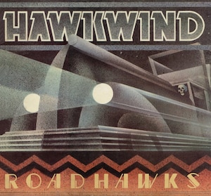
Other Hawkwind projects were equally inspiring – Bubbles’ poster for a series of shows featuring the band alongside South Wales pals Man channelled the 1920s Art Deco vibe, while his artwork for the compilation Roadhawks marries Futurism with modern tendencies. Bubbles knew his art/design history and used it in a knowing way throughout his career. This methodology is typical today, but in the 1970s, it was anathema. For this alone, Barney Bubbles was a trailblazer in the world of graphic design. Yet, for all his futuristic ideas, Bubbles was beset by troubles, most notably those of back taxes created through his business partnership. He moved to the countryside in Ireland for the bulk of 1975 with his wife and three-year-old son, taking advantage of tax breaks for artists.
When he returned to London in 1976, there was a break with the past – a new haircut and a new record label to work for, one that embodied the smartest, most savvy version of a renewed form of music: punk. One might argue that certain early lineups of Hawkwind were “punk” (in attitude), but it was Bubbles’ association with Stiff Records and associated labels which would lead to the most iconic collection of work of his career. Oddly, most of this came when designing for the most aesthetically “soft” and artistically fickle of their acts.
Elvis Costello, for instance, couldn’t have been farther from what Bubbles had deemed worthwhile when he arrived on the Stiff Records roster – Declan McManus, the son of a musician and bandleader, and himself a recently-converted British purveyor of Country & Western music. Stiff management changed Costello’s personal look and did their best to promote a sense of anonymity and instability in the talented young songwriter’s public persona. Bubbles followed suit in the design of Costello’s records, destabilizing his personality and providing a platform for Elvis to reinvent himself at will.
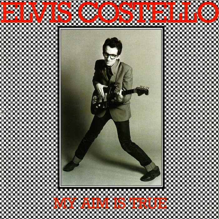
For Costello’s first release, the aptly-misnamed My Aim Is True, Bubbles created something as visually confusing as the young artist’s whereabouts in history. Costello was kitted out in horn-rimmed glasses, and traded in his more casual, loose-fitting clothing for a suit jacket, dress shirt, skinny tie and jeans on the cover. The black and white image was surrounded by a checkered field, wherein each cell spelled out the words “ELVIS IS KING” in slight slab serifed type with the artist’s name and album title overlaid in red. The back of the album featured an awkward Bubbles art-directed shot of Costello with the protagonist in mid-strum looking askance from the camera, his knees bent awkwardly.
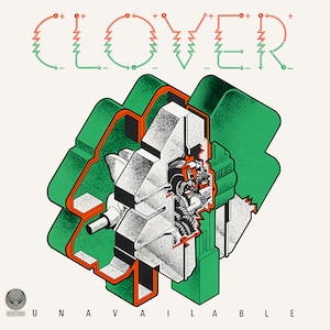
On My Aim Is True Costello was backed by the band Clover, a funk/country rock band from California residing in the UK at that time (and who would later split with members to form Huey Lewis and the News and The Doobie Brothers). Clover was something of an anomaly in the pub rock scene in the UK during their seven-year tenure, their funk tendencies never really catching hold, despite a record (aptly named Unavailable) on Vertigo in 1977 with an amazing cover designed by Bubbles depicting an exploded view of an isometric 4-leaf clover revealing the mechanics working within. The band’s name is spelled out in stylized custom lettering reminiscent of basic power wiring, and aesthetically feels very post-punk for a terrible hybrid country/funk album overloaded with bongos, harmonica solos, and no real sense of who the singer actually is. The design, however, is beautiful.
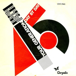
1977 was a busy year for Bubbles – another iconic project was the design of a 7-inch single for Generation X, the Billy Idol-fronted punk band. The Your Generation / Day by Day 45 featured an avant-garde composition inspired by the work of Polish theorist, painter and pioneer of graphic design Henryk Berlewi printed in red and black. By cloaking punk music in a Constructivist skin, he placed the music in a historical context of similar movements.
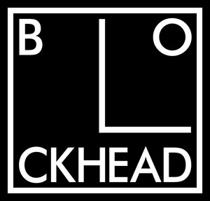
He would link the musical avant-garde of the ’70s with the visual avant-garde of the ’20s again on countless other projects, perhaps most notably on the “Blockhead” logo for Ian Dury’s backing band. This operational methodology is commonplace today – in fact, we are inundated by it. The act of historical reference, of quoting history and culture in a knowing way, is one of the tenets of postmodern design. But it’s important to remember that Bubbles (and many others) was doing this well before it was recognized as a potential way of working.
This is one of the most appealing things about his work – he was creating new possibilities with his designs, infusing them with multiple meanings, potential readings, and visually rich form in a time where other designers were not operating in the same way. The act of utilizing a number of pseudonyms to sign his work – alongside “Barney Bubbles,” he was also credited under the moniker Jacuzzi Stallion, Heeps Willard and a litany of other oddball noms du designé – underlies the unsigned nature of most of the world’s graphic design work, both yesterday and today.
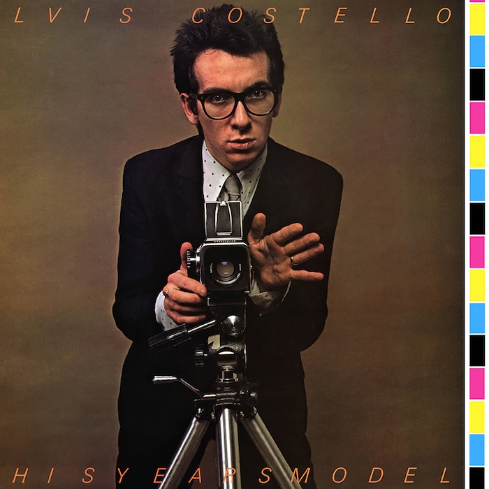
Bubbles’ mastery of graphic design and print production processes helped support his graphic authorship by exposing those processes in the work itself. He shifted the cover design of Elvis Costello’s album This Year’s Model left a few centimeters so that the CMYK color registration bars that would normally be trimmed off an album design became one of the primary visual components. The photo on the cover shows Costello posing behind a camera on a tripod – the model becoming the photographer, both the subject and the object of the album.
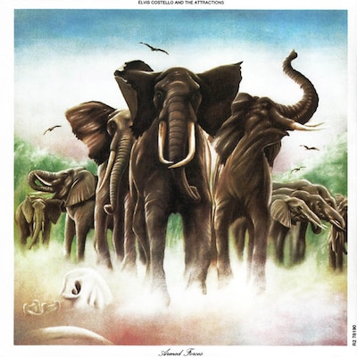
Bubbles’ visual stamp is all over the early Costello catalog – from the scuff marks pre-printed on Get Happy to referencing the visual stylings of Blue Note designer Reid Miles for Almost Blue to the graphic tour de force that is Armed Forces. The latter is a record cover unlike any other – the 12-inch folds out into 16 panels, both sides loaded with patterns and visual form referencing avant garde art history, exuberant faux animal skin, and multiple illustrations of military figures done up in a pop style by the French collective Bazooka.
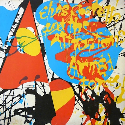
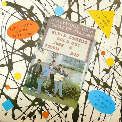
The inner sleeve features a pair of twin Brutalist compositions composed of paint sample chips, posed photography, and typography inspired by concrete poetry, all printed in bright primary colors. The Live at Hollywood High 7-inch record that accompanied the album extended and exposed the rich visuals while knowingly revealing the hand of the designer, most notably through the misspelling of “Adcicents Will Happen” on the cover (this theme would be extended in the 7-inch single for the same song, wherein the printed cover was assembled in the interior of the sleeve, leaving the cover blank).
Bubbles’ fascination with other graphic and conceptual themes would play out in almost every project of his career – from the investigation of banal home improvement via Ian Dury and the Blockheads’ Do It Yourself album to retrofitting the classic typography of Penguin book covers for his series of cover designs for Utility Records to subverting Soviet iconography for Nick Lowe’s Cracking Up. His experiments would span other media, as well, including art films, music videos for The Specials, Squeeze, Elvis Costello and others; stage design and choreography for Hawkwind; innovative Memphis-esque furniture design; and highly graphic paintings and artwork.
Bubbles died by his own hand in 1983, but the impression that he left on graphic design is indelible. It’s interesting that it is only now that we, a culture whose fascination with record packaging design is dissolving due to the ubiquity of music that exists purely in digital forms, are just coming to grips with the impact that this one graphic designer has had on the whole sphere of cultural production we call “design.” Additionally, previously unknown Bubbles’ works keep coming to light in print and on the internet – he was such a prolific designer and due to his anonymity, we may never see an entire catalog of his work. Perhaps he would have like it this way – living on as the ghost in the mechanical production.
This essay relies heavily on the research of Paul Gorman and Rick Poynor, both of whom have chronicled Bubbles’ work in depth and explored what he means to the continuum of graphic design history. I am indebted to both.
Header image © United Artist Records