A Tribute to Graphic Designer Shusei Nagaoka
You knew you made it in the ’70s when your band had its own working relationship with a visual artist. Commercial illustrators, graphic designers and art students alike all wound up becoming synonymous with pop, R&B and rock acts in greater, more memorable ways than they would’ve if they’d stuck to advertising or pop art – Hipgnosis, Roger Dean, Neon Park, Barney Bubbles, Pedro Bell and Peter Saville all became famous in their own right, impossible to separate from a listener’s impressions of what a band was as the guy tweaking knobs in the studio. Shusei Nagaoka, who passed away on June 23 of this year, was one of those artists – and his imprint wasn’t just on a band or two, but a whole all-too-brief epoch of sci-fi pop art.
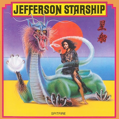
In 1970, Nagaoka set up a studio in Hollywood and began creating album art. While the Japanese faux-exoticism of Jefferson Starship’s 1976 LP Spitfire was one of his first most visible works, his style would soon come into its own in a far more characteristic way. Incredible Journey, the second album by Florida fusion-prog band Flight, was an early manifestation of what would become Nagaoka’s visual trademarks: across a gradiated, colorful vacuum of space, hovering in front of a radiant sun, is a bizarre spaceship constructed of an amalgam of musical instruments. Horns gleam like futuristic engine exhausts, keys radiate around the glowing hull, and the band’s name itself looms alongside it in supercar-badged chrome.
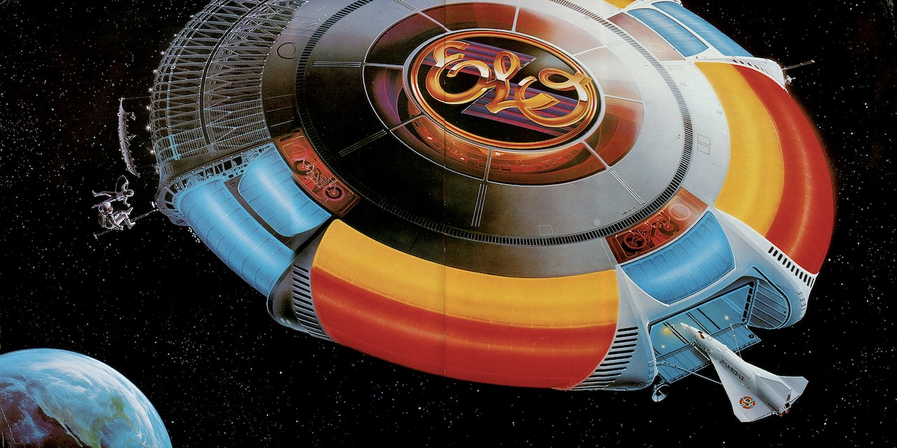
His aesthetic spread further beyond the margins on two of his most immediately identifiable works – jackets that would put his illustrations on millions of record shelves in the fall of 1977. The first took the Josh Kosh-designed glowing sigil from the cover of Electric Light Orchestra’s A New World Record, and transformed it into a Kubrickian space station complete with a docking shuttle straight out of 2001: A Space Odyssey. Look past the glowing fission-hum neon, over the credibly aerospace-tech-adorned steel, and through the amber glass that rings the golden gleam of the ELO logo, and you’ll be able to spot the inner workings of what looks like an engineer’s control panel – a command center for space-age power pop.
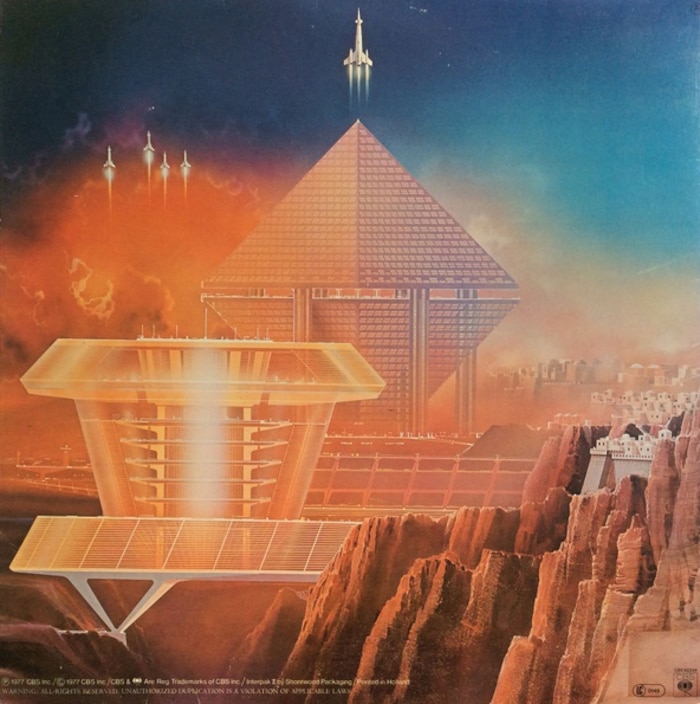
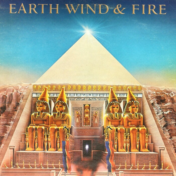
It was only a month after the release of that LP, Out of the Blue, that the first fruits of Nagaoka’s most long-standing artistic collaboration hit stores, Earth, Wind & Fire’s All’N All. What language barrier there might have been was quickly overcome by a mutual understanding of what iconography EW&F were looking for. Maurice White, the group’s bandleader, studied metaphysics, Egyptology and theological philosophy, all of which was incorporated by Nagaoka into a massive tableau titled Helios.
As a gatefold LP, the front cover depicts a scene of a Ramesseum-esque temple carved into a mountainside, capped by a pyramid with a glowing peak; open the gatefold and the landscape extends westward to gleaming glass superstructures and tandem shuttle launches. The inner fold is the stuff of pure ’70s spirituality, more Egyptology (replete with the Sphinx and a pyramid with an eye set near the top) mingling with the symbology of world religions, Zodiac signs, and the kalimba that carried through from Earth, Wind & Fire’s earliest songs as a totemic musical instrument which connected the band back to Africa.
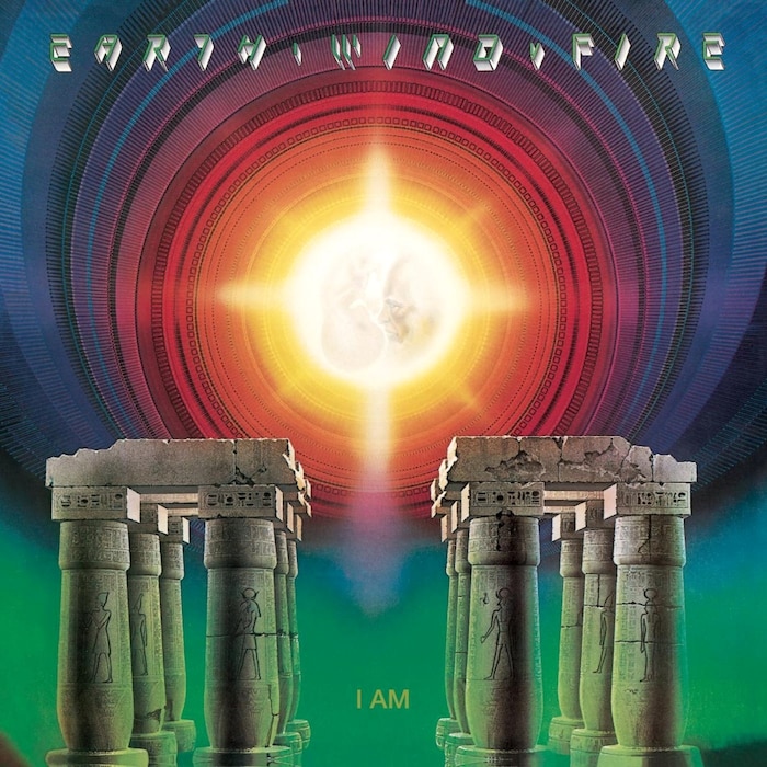
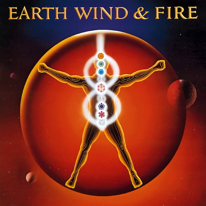
“Even though we spoke different languages, we shared a vision,” wrote White upon Nagaoka’s passing. “His talent and creativity helped make each of our collaborations memorable and helped extend the message in our music into the visual plane of color harmony and symbolic expression.” To this day, they’re the band Nagaoka is most remembered for depicting. Nagaoka would continue to provide the artwork for successive EW&F albums, from 1979’s radiant I Am through 1983’s Vitruvian-Man-gone-cosmic Powerlight, and put his retroactive mark on their earlier works through their 1978 best-of compilation.
His work with other groups, meanwhile, renewed the focus on star-cruiser iconography that he’d hinted at on Incredible Journey – a focus that found a solid cultural foothold once the runaway success of Star Wars launched countless pop-culture hangers-on into deep-space fantasy. Nagaoka’s work held a strong visual kinship with neofuturist concept art visionaries like Ralph McQuarrie and Syd Mead, people who visualized massive-scope cities and vehicles of tomorrow. And with his immaculate, pinpoint-airbrushed detail, he could make even his more outlandish ideas look credible.
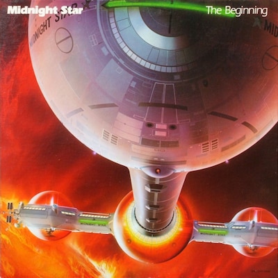
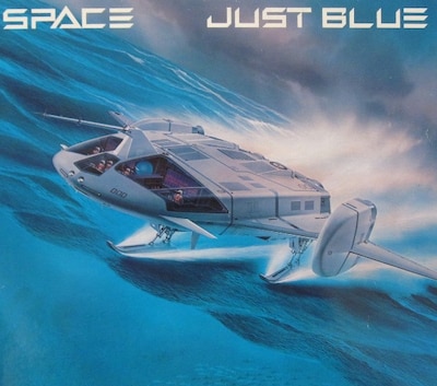
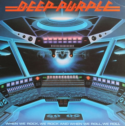
A nude woman with velvety skin is flanked by a pair of boogie-down robots on the back cover of the Munich Machine’s A Whiter Shade of Pale, the Sylvers surf far above the clouds astride a rocket shaped like their name on New Horizons, a tricked-out ski-boat makes a break for a The Spy Who Loved Me-esque underwater hideaway on Space’s Just Blue and gleaming starcraft act as massive exploratory vessels for Deep Purple, Midnight Star and Sun.
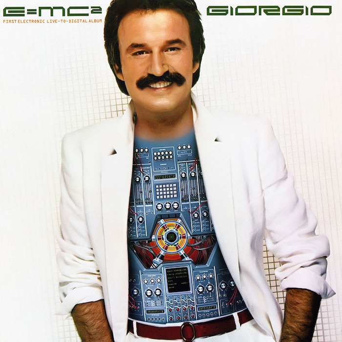
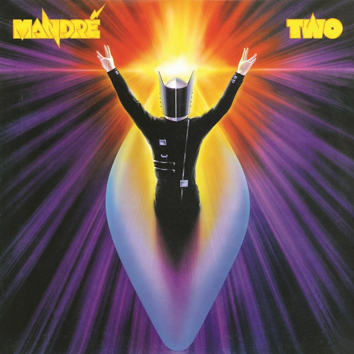
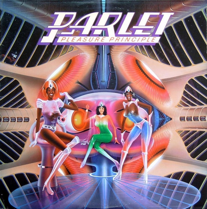

It’s fitting that Nagaoka’s artwork flourished in the late ’70s and early ’80s, when technological advances and disco-floor emphasis on altered-state audiovisual stimuli made new music feel like something out of the pages of Omni. Rare was the Nagaoka-illustrated LP that didn’t somehow sound like it looked. Synth wizards like Giorgio Moroder and Mandré wore their hi-tech trappings like prototypes of the cyberpunk future that William Gibson would soon elaborate on. Pleasure Principle, by P-Funk spinoff Parlet, offered a glimpse inside the lounge of a new kind of Mothership refitted for feminine glamour and a Casablanca budget. And Maze’s Inspiration was as moonlit as Quiet Storm soul got – though it’s not entirely clear what uncharted planet that moon orbits.
Ironically enough, it’s hard to find info on the past of a man so adept at depicting machines of the future. His biographical details aren’t widely known, aside from what his website lets on: before his prime as a record cover and poster illustrator, he had some early work published in a 1955 issue of Chūgakusei no Tomo, dropped out of Mushashino Art University in 1958 to focus full-time on commercial illustration, had some unelaborated-upon preparatory contribution to Osaka’s Expo ‘70 and set up shop in Hollywood in 1970.
It’s not clear how much of his work could be considered “personal,” though given his young age when his hometown of Nagasaki was devestated by an atomic bomb – his family had relocated to nearby Iki Island at the time – it’s not hard to imagine his sci-fi utopianism was at least somewhat of a response. At least once he confronted the topic head-on: He depicted Tokyo being destroyed in a flash of an atomic explosion for the 1984 NHK documentary The Earth After Nuclear War, waves of flaming radiation shooting across the landscape in disturbingly vivid renderings.
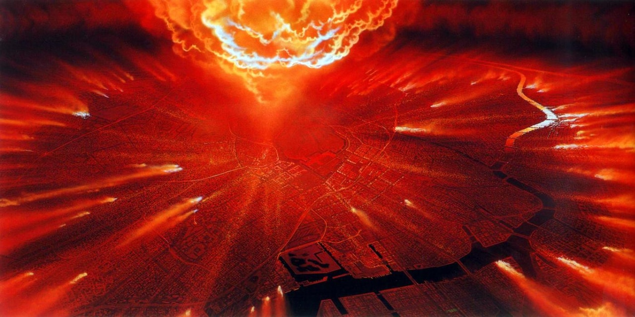
It’s also hard to keep track of what Nagaoka contributed to the art and illustration world past the mid-’80s or so. His visual impact on record shelves seems to have diminished with record labels’ post-disco-crash reluctance to splurge on anything that could be categorized as dance music. From 1981 onwards his major-label work graced only two prominent artists’ covers: Earth, Wind & Fire and Japanese ambient/New Age artist Kitaro.
But that was only part of the downturn: the writing was on the wall for record packaging, with cassettes and eventually CDs earning enough of a market share to make sprawling, hyper-detailed works like Nagaoka’s covers impossible to do justice. For the remainder of the ’80s, Nagaoka made his way in commercial illustration, whether it was in the service of car advertisements, obscure sci-fi paperbacks or the ‘85 Tsukuba Expo.
In 1990, when Tokyo Broadcasting System journalist Tohiro Akiyama became the first Japanese astronaut when he visited and reported from the Mir space station, he brought one of Nagaoka’s artworks with him. It’s not widely reported just which artwork that was, but it’s fun to think it was Helios – an astral, time-spanning connection to the stars that happens to contain a killer rendition of “Serpentine Fire.”
